Counting cells

Introduction

In this post I’ll talk about my largest project in terms of time. It started in the middle of year 2000 as my Master thesis subject and ended up extending itself until around mid 2013 (although it remained in hibernation for almost 10 years in between). The project was an “automatic cell counter”. Roughly speaking, it is a computer program that takes an image with two kinds of cells, and tells how many of each kind of cell there is in the image.

At the time, my advisor was professor Adrião Duarte (one of the nicest persons that exists is in this planet). Also, I had no idea about the biology side of things, so I had a lot of help from Dr. Alexandre Sales and Dra. Sarah Jane both from the “Laboratório Médico de Patologia” back in Brazil. They were the best in explaining to me all the medical stuff. Also, they provided a lot of images and testing for the program.

The “journey” was an adventure. From publishing my first international paper, going to Hawaii on my first plane flight, down to asking for funding to buy a microscope in the local financing agency (FAPERN). Although this won’t be a fully technical post, the goal of the post will be to talk about the project itself and things related to it during the .

The problem

The motivation for the project was the need for cell counting in biopsies exams. The process goes more or less like this; When you need a biopsy of some tissue, the pathologist prepares one or more laminas with very very thin sheets of the tissue. The tissue in those laminas are coloured with a special pigment. That pigment has a certain protein designed to attach itself to specifics substances present in the cells that are behaving differently like ongoing division, for instance. The result is that the pigment makes the cells (actually the nucleus) to appear in a different colour depending on the pigment used. Then, we have means to differentiate between the two “kinds” of cells in the lamina.

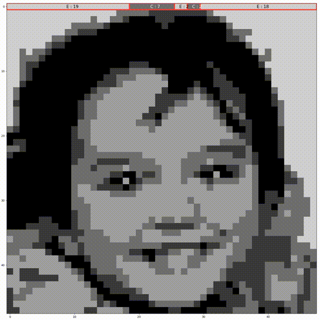
The next step is to count the cells and compute how many of them is coloured and how many are not. This ratio (percentage of coloured vs non-coluored) will be the result of the biopsy. The problem here is exactly the “counting” procedure. How the heck does one count individual cells? The straight forward way to do that is to put the lamina into the microscope, look into the objective and, patiently and with caution, start counting by eye. Here we see a typical image used in this process. 
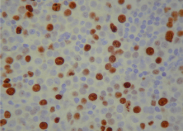
There are hundreds of nucleus (cells) in those kinds images. Even if you capture the image and count them in a screen, the process is tedious! Moreover, the result can’t be based on one single image. Each lamina can produce dozens or hundreds of images that are called fields. To give the result of an exam, several fields have to be counted.

Nowadays, there are machines that do this counting but they are still expensive. At the time I did the project, they were even more expensive and primitive. So, any contribution to this area that would help the pathologist to do this counting more precisely and easily would be very good.

The App

The solution proposed in the project was to make an application (a computer program at the time) that would do this counting automatically. Even at the time, it was relatively easy to put a camera into a microscope. Today it is almost a default 😄. So, the idea was to capture the image from the camera coupled in the microscope, give it as input to the program, and the program would count how many cells are in the image.

Saying it like this, makes it sound simple… But it is not trivial. The cells, as you can see in the previous sample image, are not uniformly coloured, there is a lot of artefacts in the image, the cells are not perfect circles, etc. Hence, I had to device an algorithm to perform this counting.

The algorithm is basically divided in 3 main steps that are very common in image processing solutions;
1 – Pre-Processing
2 – Segmentation
3 – Post-Processing
4 – Counting

Algorithm

The pre-processing stage consisted in applying a colour transform and performing an auto-contrast procedure. The goal was to normalise the images for luminance, contrast, etc. The segmentation step consisted in label each pixel as one of three categories: cell 1, cell 2 or intra-cellar medium (non-cell). The result would be an image where each pixel is either 1, 2 or 3 (or any arbitrary triple of labels). After that comes the most difficult part, which was the post-processing. The segmentation left several cells touching each other or produced a lot of artefacts like tiny regions where there were no cells but was marked as a cell. Hence, the main scientific contribution of the project was to make use of mathematical morphology to process the segmented image and produce an image with only regular pixels in the cells. Finally we have the counting step which resulted in the number of cells labeled as 1 or 2. The technical details of all those steps are in the Masters document or in the papers (see references).

Old windows / web version

As the final product of the Masters project, I implemented a windows program in C++ Builder with a very simple interface. Basically the user opens an image and press a button to count. That was the program used by Dr. Alexandre in his laboratory to validate the results. I found the old code and made available in GitHub (see references)

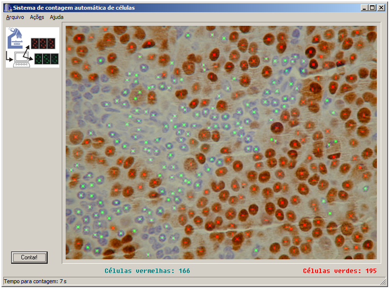
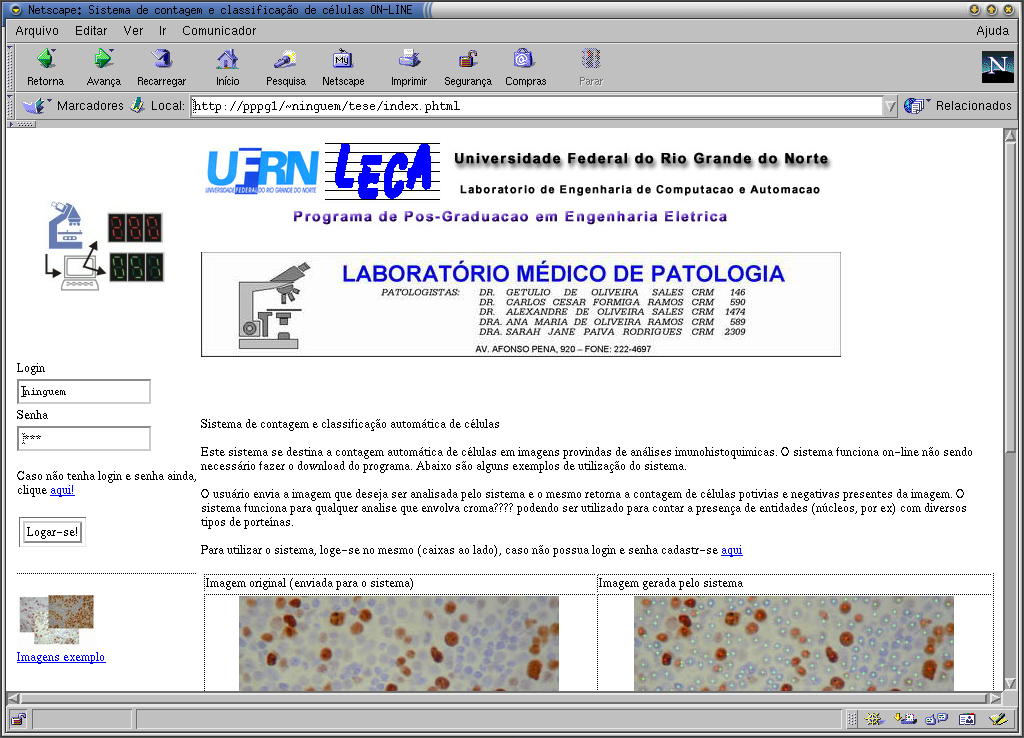
Together with the windows program, I also made an “on-line version” of the application. At the time, an online system that would count cells by uploading an image was a “wonder of technology”😂. Basically it was a web page powered by a PHP script that called a CGI-bin program that did the heavy duty work (implementation of the algorithm) and showed the result. Unfortunately I lost the web page and the CGI code. All I have now is a screenshot that I used in my masters presentation.

iOS

After the Masters defence, for a couple of months I still worked a bit to fix some small stuff and made some small changes here and there. Then, I practically forgot about the project. Dr. Alexandre kept using it for a while but no modifications were made.

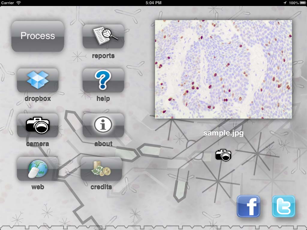
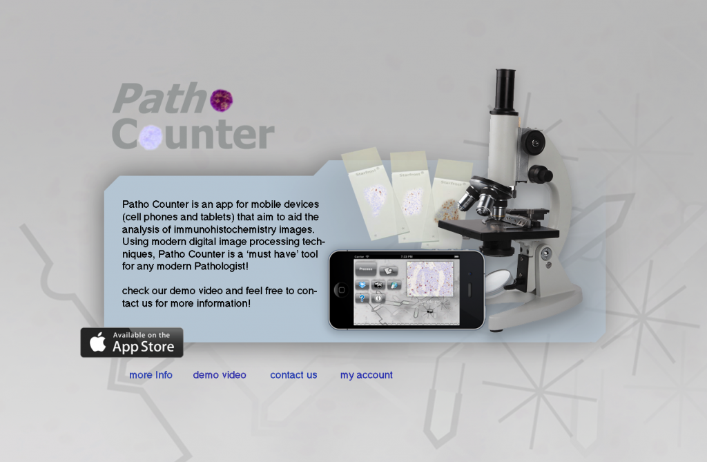
Almost 10 years later (around 2012), I was working with iOS development and had the idea of “porting” the program to a mobile platform. Since the iPhone (and iPad) have cameras, maybe we could use to take a picture directly in the objective of the microscope and have the counting right there! So, I did it. I made an app called PathoCounter for iOS that you could take a picture and process the image directly into the device.

The first version was working only on my phone. Just to be a proof of concept (that worked). Then, I realize that the camera on the phone was not the only advance that those 10 years of moore’s law gave me. There was a godzilion of new technology that I could use in the new version of the project! I could use the touch screen to make the interface easy to operate, and allow the user to give more than just the image to the app. The user could paint areas that he knew there were no cells. We could use more than the camera to take images. We could use Dropbox, web, the gallery of the phone, etc. We could produce a report right on the phone and share with other pathologist. The user could have an account to manage his images. And so on… So I did most of what came to my mind and end up with a kind of “high end” cell counting app and made it available in the Apple store. I even put a small animation of the proteins antigens “fitting” in the cell body 🤣. For my surprise, people started to download it!

At first I hosted a small web system where the user could login and store images so he could use within the app. I tried to obey some rules for website design but I’m terrible at it. Nevertheless I was willing to “invest my time” to learn how a real software would work. I even learned how to promote a site on facebook and google 😅.

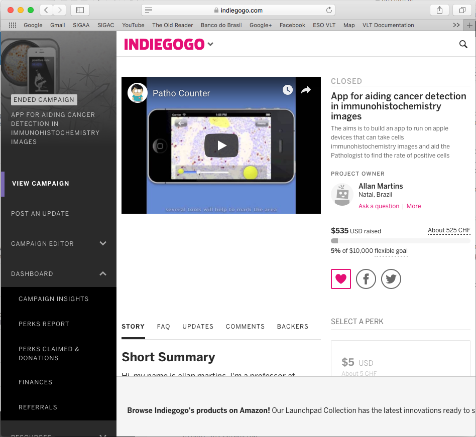
However, I feared that if I had many users the server could not be robust enough, so I tried a crowdfunding campaign at indiegogo.com to buy a good computer to make a private server. For my surprise, some friends baked up the campaign and, in particular, one of my former students Victor Ribas donated $500 dollars! I’m still thankful to him and I was very happy to see such support!! Unfortunately the amount collected wasn’t enough to buy anything different form what I had, so I decided do donate the money to a local Children Hospital that treats children with cancer. Since the goal of the app was to help out with the cancer fight, I figure that the hospital was a good choice for the donation.

Sadly, this campaign also attracted bad audience. A couple of weeks after the campaign closed and I donated the money, I was accused (formally) of doing unethical fund-gathering for public research. Someone in my department filed a formal accusation against me, and, among some things, told that I was obtaining people’s money from unsuccessful crowdfunding campaigns. That hurts a lot. Even though it was easy to write a defence because I didn’t even kept the money, I had to call the Hospital I did the donation and ask for a “receipt” to attach as a proof in the process. They had offered a receipt at the time I made the donation, but I never imagined that two weeks later I would go though this kind of situation. So, I told them that wasn’t necessary because I was not a legal person or company, and I didn’t want to bother them with the bureaucracy.

Despite this bad pebble in the path, everything that followed was great! I had more the 1000 downloads all around the world. That alone was enough to make me very happy. I also decided to keep my small server running. Some people even got to use the server, although just a handful. Another cool thing that happened was that I was contacted by two pathologists outside Brazil; one from Italy and another from United States. The app was free to download and the user had 10 free exams as a demo. After that the user could buy credits, which nobody did 😂 (I guess because you just could reinstall the app to get the free exams again 😂). I knew about that “bug”, but I was so happy to see that people were actually using the app that I didn’t bother (although Dr. Alexandre told me that I was a “dummy” to not properly monetise the app 🤣).

The app was doing so much more than I expected that I even did some videos explaining the usage. Moreover, I had about 2 or 3 updates. They added some small new features, fixed bugs, etc. In other words, I felt like I was developing something meaningful, and people were using it!

Results

As I said, the main result to me was the usage. To know that people were actually using my app felt great. Actually, the girl from United States that contacted me said that they were using it in dog exams! I didn’t even knew that they did biopsy in animals 😅.

Analytics

At the time I was into the iOS programming “vibe” I use to put a small module in all my apps to gather anonymous analytics data (statistics of usage). One of the data I gathered, when the user permitted of course, was the location were the app was being used. Basically every time you used the software, the app sent the location (without any information or identification of the user whatsoever) and I stored that location. After one or two year of usage, this was the result (see figure).

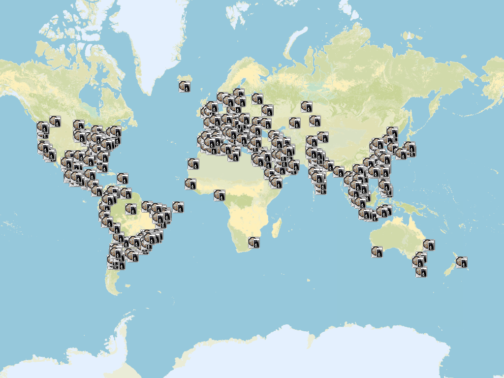
Each icon is a location where the app was used and the user agreed in sharing the location. The image speaks for itself. Basically all the continents were using the app. That is the magic of online stores nowadays. Anybody can have your app being used by, easily, thousands of people! I’m very glad that I lived this experience of software development 😃.

Media

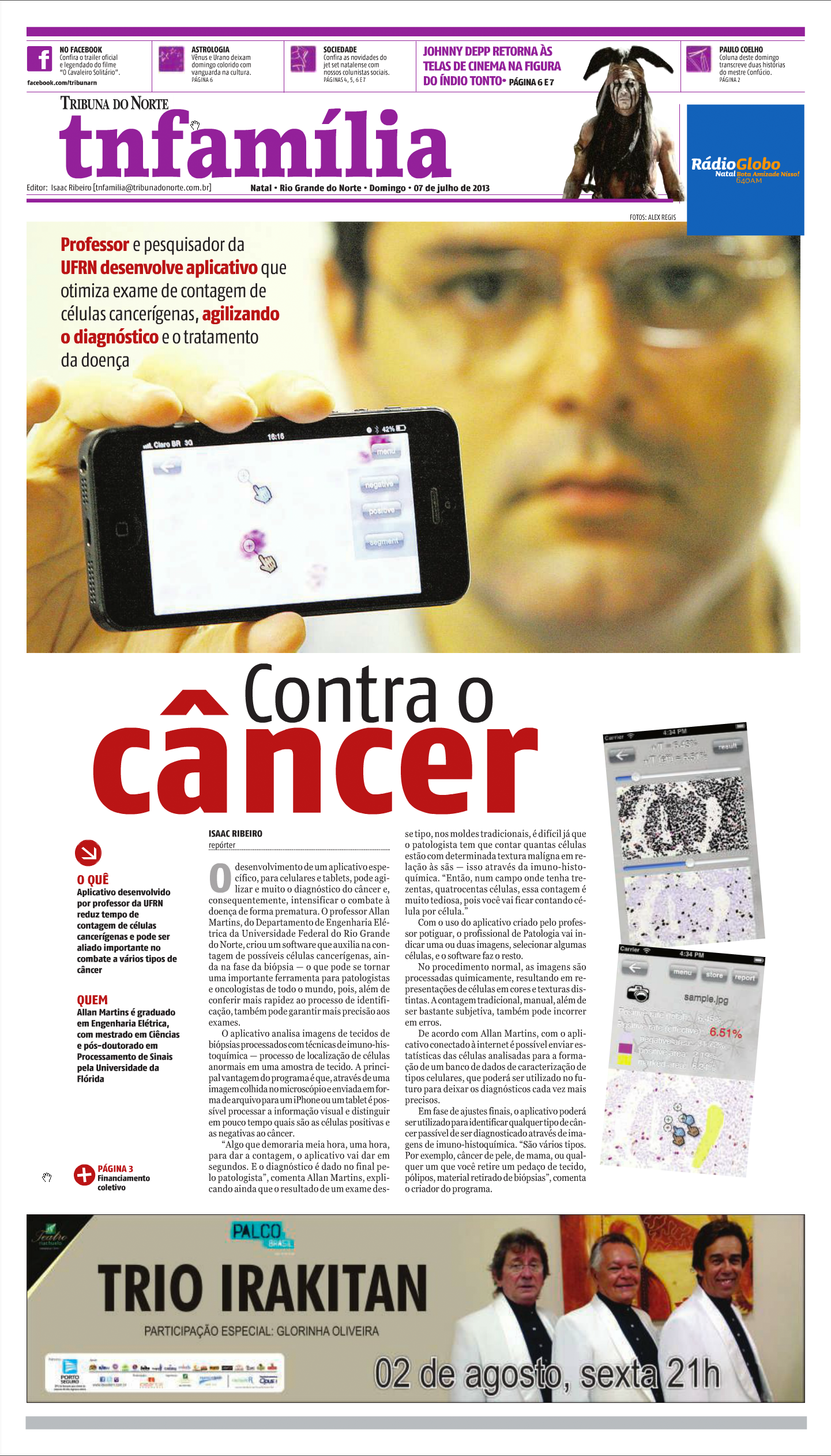
Somehow the app even got the media’s attention. A big local newspaper and one of the public access TV channels here in my city, contacted me. They asked if they could write an article about the app and interview me about it 🤣😂. I told them that I would look bad in front of the camera but I would be very happy to talk about the app. Here goes the first page of the newspaper article in the “Tribuna do Norte” newspaper and the videos of the interviews (the TV Tribuna and TV Universitária UFRN).

Conclusion

I don’t know for sure if this app helped somebody to diagnose an early cancer or helped some doctor to prescribe a more precise dosage of some medicine. However, it shows that everyone has the potential to do something useful. Technology is allowing advances that we could never imagine (even 10 years before when I started my masters). The differences in technology from 2002 to 2012 are astonishing! From a Windows program, going through an online web app, to a worldwide distributed mobile app, software development did certainly changed a lot!

As always, thank you for reading this post. Please, feel free to share it if you like. See you in the next post!

References

Wikipedia – Immunohistochemistry

C++ Builder source

Sistema de Contagem e Classificação de Células Utilizando Redes Neurais e Morfologia Matemática – Tese de Mestrado

MARTINS, A. M.; DÓRIA NETO, Adrião Duarte ; BRITO JUNIOR, A. M. ; SALES, A. ; JANE, S. Inteligent Algorithm to Couting and Classification of Cells. In: ESEM, 2001, Belfast. Proceedings of Sixth Biennial Conference of the European Sorciety for Engineer and Medicine, 2001.

MARTINS, A. M.; DÓRIA NETO, Adrião Duarte ; BRITO JUNIOR, A. M. ; SALES, A. ; JANE, S. Texture Based Segmentation of Cell Images Using Neural Networks and Mathematical Morphology. In: IJCNN, 2001, Washington. Proceedings of IJCNN2001, 2001.

MARTINS, A. M.; DÓRIA NETO, Adrião Duarte ; BRITO JUNIOR, A. M. ; FILHO, W. A. A new method for multi-texture segmentation using neural networks. In: IJCNN, 2002, Honolulu. Proceedings of IJCNN2002, 2002.

3+

Doing better than Lego House

Introduction

In this post I’ll talk about a small experience I had with a Lego set that I acquired on my trip to Legoland in Billund, Denmark (yes, the original Legoland 😃). I’ll not talk about the trip itself, which was the best of my life. It was so because I had the opportunity to bring my daughter and my niece to see their happy faces when they entered in the park. Rather, I’ll talk about a small project that was motivated by a special LEGO set I bought on LEGO House.

Lego House (https://www.legohouse.com/)

The Lego House is amazing. It is located close to Legoland, also in Billund. I won’t talk about it because I would have to write a book 😄. The point is that, there is a Lego Store inside it, and they sell a very special LEGO set: the set #40179, or “Personalised Mosaic Picture”. It is a set that contains only a large base plate with 48×48 spaces (currently the largest in a set) and about 4500 1×1 plate divided in 5 different colours (yellow, white, black and two shades of grey).

Lego Custom Mosaic set

The goal of the set is to allow the owner to “draw” a mosaic picture with the 1×1 plates on the big base plate. What makes this set special is the instructions. The instructions are a big 1:1 picture the size of the plate itself which indicates the position and colour of all 1×1 little plates. You may ask: What picture comes in the set? yours!

The Lego Set

As I mentioned, it is your picture that comes with the instructions! When you buy the set in the store, they guide you to a small photo booth where they take your picture to make the instructions. The whole process is made for children and it is a piece of work 😆. First, they take some pictures of your face and show to you in a screen inside the booth. There, you see how the mosaic is going to look like when you assemble it. When you are satisfied with the mosaic, you go out of the booth and wait your custom set. The set is delivered automatically via a small hole beside the cabin. While you wait, you watch an animation of a couple of LEGO mini figures dressed as workers and producing your set. When done, the booth spits out your big set with your picture turned into The LEGO instructions poster.

Doing that for my 3 year old

I could not leave The LEGO House whiteout buying one of those. Of course I would not put my picture on it. Instead, I wanted to make one for my little daughter. And that was when the problem arose. The lady in the store told me that it would be very very difficult to get a good picture for a 3 year old. First, she is not tall enough. Then, she would not be quiet enough and her little head would not be close enough to the camera to make a good mosaic. All that is true. Remember that the picture should be perfect because the mosaic would be a representation of her face using only 4 shades of grey (and possibly a yellow background) in a 48×48 pixel matrix.

But wait… What if I did the mosaic myself? This set is practically only “software”. Regardless of the picture, the set have 4500 1×1 plates and a giant 48×48 base and that’s it! The rest is image processing! I talked to the lady in the store and told her that I would take the risk of not having a good picture. She told me about all the difficulty, bla bla bla, but I insisted: “Trust me, I’m an engineer” (Just kidding, I told her I just want the 4500 1×1 plates 😅). She finally agreed. We even tried to get a “reasonable” mosaic, but it is really very very difficult. The lady was very nice and was very patient. We tried like 6 or 8 times but the best we could do was this:

Original Lego mosaic picture

I didn’t like the mosaic at all (too flat shapes) but remember that I had other plans 😇. Besides, my little one does not like pictures and it is rare to get a picture with her smiling on it. Anyways, with the set bought, I was ready to do my small weekend project with it as soon as I was back.

Doing a better mosaic

The first thing I had to do was to find a better picture to be turned into the mosaic. So I started to dig for a picture that I like (at least one with her smiling. 😅). It didn’t even needed to be a full picture. I could (and still can 😊) take a picture and use it. The picture would be reduced to 48×48 pixels anyway, so practically any picture where she appear, could be a potential mosaic candidate.

Crop of the picture used to make the first mosaic

With the picture chosen, it was time to do the magic. I’ll won’t detail exactly the steps I did to process the image because this is very dependent on the crop that you do and things like illumination, tones, etc. Depending on the picture, it would require a very specific and different set of steps. The result of the photoshop processing was the following

Result of the “mosaicfication” of the picture. Left: Greyscale picture 48×48. Right: Mosaic picture 48×48 with only 4 levels of grey (and a background)

Python code

Now that had the image is very small (48×48 pixels) with only 5 different “colours”. That is what makes this step not trivial. When the processing done, in theory I could print it on a large paper and start building the set. But I figure that I could easily mistake a shade of grey with another or get lost in the middle of the assembly. So, I decided to ask for computer help. I did a small python program that loads the image and aid me in the assembly process.

The script do two main things: First, it translates the “colours” of the image into something more readable like letters (A to E according to the shade of grey in the pixel). Then, it creates an “assembly” sequence that will help me to stick the small plates in the right place on the big base plate. This second step is what makes the assembly more “comfortable”. The idea was to show the image in the screen and highlight each line one at a time. In the highlight, instead of show the letter in the place where I should put each plate, it would show each “block” of the same colour, showing the amount of plates needed and the corresponding letter for each block. Then, it was a matter of put all this in a loop for each line and wait for a keypress at each step to continue the assembly.

Gif of the steps showed by the program. In each highlighted line, the blocks of pieces with the same colour have the indication of the letter and the amount of plates needed

The whole python code is very very simple.
#!/usr/bin/env python3
# -*- coding: utf-8 -*-
"""
Created on Wed Aug  8 18:16:32 2018

@author: allanmartins
"""
from matplotlib import pyplot as plt
import numpy as np

img = np.uint8(255*np.round(255*plt.imread('bebel48x48x5.png')))

values = np.unique(img)

for (i, v) in zip(range(len(values)), values):
    img[img==v] = 5-i


fig = plt.figure(figsize=(20, 20))

line = -0.5
for I in img: 
    plt.cla()

    arrayTmp = np.concatenate((np.array([1.0],dtype=np.float32),np.abs(np.diff(I))))
    
    arrayTmp = np.greater_equal(arrayTmp, 0.5)
    
    idx = [i for (i, v) in zip(range(len(arrayTmp)),list(arrayTmp)) if v>0]
    levels = I[idx]
    idx.append(48)
    
#    fig = plt.figure(figsize=(15, 15))
    plt.set_cmap('gray')
    plt.imshow(img, vmin=1, vmax=6)

    for i in range(len(idx)-1):
        lineColor = [1, 0.2, 0.2]
        textColor = [1, 1, 1] if not levels[i] == 5 else [0, 0, 0]
        plt.plot([idx[i]-0.5, idx[i+1]-0.5, idx[i+1]-0.5, idx[i]-0.5, idx[i]-0.5], [line, line, line+1, line+1, line], color=lineColor, linewidth=4)
        plt.text(-0.75+(idx[i]+idx[i+1])/2.0, line+0.75, '%c : %d'%(levels[i]+64, idx[i+1]-idx[i]), color=textColor, size=15)


    plt.show(block=False)
    fig.canvas.draw()
    fig.canvas.flush_events()


    sQtd = ''
    sLevels = ''
    for d,l in zip(np.diff(idx), levels):
        sQtd += '%4d'%d
        sLevels += '%4c'%(l+64)
        
    print(sQtd + 'n' + sLevels)
    print('n')
    input()
    
    line += 1


The result

As result, I have the infra-structure now to make any mosaic with any picture. I just have to be patient to disasbemble the old one and follow the script to assemble a new one. The final result for the first image is here (and a time lapse of the assembly). I don’t remember exactly the time it took to finish, but by the number of frames in the time lapse I estimate about 2h for the whole process.

Custom Lego mosaic picture

Time lapse of the assembly process

Conclusion

Despite the title of this post, LEGO is making an awesome work with the set. If you google for images of mosaics you will see that, in general, if you follow the guidelines, your LEGO mosaic will be cool! it is very difficult for a consumer product to be perfect with this kind of technology (image processing, colour quantisation and etc). So, it is good to know some coding in cases like this, which allow us to take advantage of the “hardware” of the set (4500 1×1 plates) and do our own custom “custom LEGO Mosaic set” 😀.

I hope you liked this post! See you in the next one!

2+

We take gears for granted…

Introduction

Since I was a kid, I always loved toys with “moving parts”. In particular, I was always fascinated with the transmission of the movement between two parts of a toy. So, whenever a toy had “gears” in it, for me, it looked “sophisticated”. This fascination never ended and a couple of year ago when I bought my 3D printer, I wanted to build my own “sophisticated” moving parts and decided to print some gears.

I didn’t want to just download gears from thingverse.com and simple print them. I wanted to be able to design my own gears in the size I want with the specifications I needed. Well… I’d never thought a would have so much fun…

So, in this post I will talk briefly about this little weekend project of mine: Understanding a tiny bit about gears!

The beautiful math behind it

At first I thought that the only math that I needed was the following \[ \frac{{{\omega _1}}}{{{\varpi _2}}} = \frac{{{R_2}}}{{{R_1}}} \] In another words, the ratio of the angular speeds is proportional to the ratio of the radius of the gears. Everyone know that, right? If you have a large gear and a small one, you have to rotate the small one a lot to rotate the big one a little. So, to make a gear pair that doubles the speed I just had to make one with, say, 6cm of diameter and the other with 3cm. Ha… but how many teeth? What should be their shape? Little squares? Little triangles? These questions started to pop and I was getting more and more curious.

At first I thought I use a simple shape for the teeth. I would not put too many teeth because they could wear out with use. Also, not too few because they had to be big and I might end up with too much slack. Gee, the thing started to get complicated. So, I decided to research a bit. For my surprise I found out that the subject “gears” is a whole area in the field of Mechanical Engineering. First thing I notice is that most of the gears have a funny rounded shape for the teeth. Also, they had some crops and hollow spaces in the teeth that vary from gear to gear. Clearly those were there for a reason.

Those “structures” are parameters of the gear. Depending on the use, material or environment, they can be chosen at design time to optimise the gear function. However, practically all gears have one thing in common : The contact of the gear teeth must be optimum! It must be such that during rotation, the working gear tooth (the one that is being rotated) must “push” the other gear tooth in such a way that the contact is always perpendicular to the movement as if we had a linear or straight object pushing another in a straight movement. Moreover, the movement must be such that when one tooth leaves the contact region, another tooth must take over, so the movement is continuous (see figure).

Figure 1: Movement being transmitted from one tooth to another. The contact and the force is always perpendicular and is continuously transmitted as the gear rotates. (source: Wikipedia. See references)

This last requirement can mathematically be archived by a curve called “Involute”. Involute is a curve that is made when you take a closed curve (a circle for example) and start to “peel of” it’s perimeter. The “end” of the peeling is the points in the involute (see figure).

Figure 2: Two involute curves (red). Depending on the starting point, we have different curves. (source: Wikipedia. See references)

So, the shape of the teeth of the gears are involutes of the original gear shape. Actually not all gears are like that. The gears that are, are called “Involute Gears”. Moreover, gears do not need to be circular. If you have a gear with another shape, you just need to make its teeth curved as the involute of the shape of the gear.

The question now is: How to find the involute of a certain shape?

Following the “peeling” definition of the involute, it is not super hard to realise that the relationship between the involute and its generating curve is that, at each point in the involute curve, a line perpendicular to it will be tangent to the original curve. With that, we have the following relation: \[ \begin{array}{*{20}{l}} {\dot X(t)\sqrt {{{\dot x}^2}(t) + {{\dot y}^2}(t)} = \dot y(t)\sqrt {{{(x(t) – X(t))}^2} + {{(y(t) – Y(t))}^2}} } \\ {\dot Y(t)\sqrt {{{\dot x}^2}(t) + {{\dot y}^2}(t)} = – \dot x(t)\sqrt {{{(x(t) – X(t))}^2} + {{(y(t) – Y(t))}^2}} } \end{array} \] Which is a weird looking pair of differential equations! There, \((X(t), Y(t))\) is the parametric curve for the involute and \((x(t), y(t))\) is the parametric curve for the original curve.

Some curves do simplify this a lot. For instance, for a circle (that will generate a normal gear) the solution is pretty simple: \[ \begin{array}{l} X(t) = r\left( {\cos (t) + t\sin (t)} \right)\\ Y(t) = r\left( {\sin (t) – t\cos (t)} \right) \end{array} \]

Matlab fun

So, how do we go from the equation of one involute to the drawing of a set of teeth?

To test the concept, first I implemented some Matlab scripts to draw and animate some gears. In my implementation I used a circular normal gear, so the original curve is a circle. Nevertheless, I implemented the differential equation solver using Euler’s method so I could make weird shape gears (in a future project). The general idea is to draw one pieces of involutes starting at each tooth and going to half of the tooth. Then, draw the other half starting from the end of the tooth until the end of it. The “algorithm” to draw a set of involute teeth is the following

  • Define the radius and number of teeth
  • define \(t = \theta\) and \(dt = d\theta\) (equal to some small number that will be the integration step)
  • Repeat for each n from 0 to N-1 teeth:
    • Start with \( \theta = n\frac{2\,\pi}{N}\)
    • update the involute curve (Euler’s method)
      \(X(\theta) = X(\theta) + {\dot X(\theta)}\,d\theta \)
      \(Y(\theta) = Y(\theta) + {\dot Y(\theta)}\,d\theta \)
      until half of the current tooth
    • Update the angle in the clockwise duration \( \theta = \theta + d\theta\)
    • Start with \( \theta = (n+1)\frac{2\,\pi}{N}\)
    • update the involute curve
      \(X(\theta) = X(\theta) + {\dot X(\theta)}\,d\theta \)
      \(Y(\theta) = Y(\theta) + {\dot Y(\theta)}\,d\theta \)
      until half of the current tooth
    • Update the angle in the anti-clockwise duration \( \theta = \theta – d\theta\)
If we just follow the algorithm above, our gear, although functional, won’t appear as a traditional gear. All the auxiliary parameters are not present (like the slack between teeth, cropping, etc). It will basically be a flower like shaped thing (see figure bellow).

Figure 3: Example of a gear with all auxiliary parameters equal to zero

When you use the technical parameters for a gear, it starts to shape familiar. The main parameters are called “addendum”, “deddendum” and “slack”. Each one control some aspect of the mechanical characteristics of the gear like flexibility of the teeth, depth of the teeth, etc. The next figure illustrates those parameters.

Figure 4: Parameters of a gear

The next step was to position a pair of gears next to each other. First, we choose the parameters for the first gear (addendum, radius, number of teeth, etc). For the second one, we choose everything but the number of teeth. That must be computed form the ratio of the radius.

For the positioning, we would put the first gear at the position \((0.0, 0.0)\) and the second one at some position \((x_0,0.0)\). Unfortunately the value of \(x_0\) is not simply \(r_1 + r_2\) (sum of the radius) because the involutes for the teeth must touch at a single point. To solve this, I used a brute force approach. I’m sure that there is a more direct method, but I was eager to draw the pair %-). Basically, I computed the curve for the right gear first tooth and the left gear first tooth (rotated \(2\pi/N\) so they can match when in the right position). Initially I positioned the second one at \(r_1 + r_2\) and displaced bit by bit until they touched only in only one place. In practice I had to deal with a finite number of points for each curve, so I had to set a threshold to consider that the two curves are “touching” each other.

With the gears correctly positioned it was time to make a 3D version of them. That was easy because I had the positions for each point in the gears. So, for each pair of points in each gear I “extruded” a rectangular patch by \(h_0\) in the z direction. Then I made a patch with the gear points and copied another one at \(z = h_0\). Voilà! Two gears that match perfectly!

The obvious next step was to animate them 😃! That is really simple because we just need to rotate the first by a small amount, rotate the second by this amount times the radius ration and keep doing that while drawing the gear over and over. The result is a very satisfying gear pair rotating!

Figure 5: Animations of two gear sets with different parameters.

Blender fun

Now that I got used to the “science”, I was ready to 3D print some gears. For that, I had to transfer the design to Blender, which is the best 3D software in the planet. The problem is that it would be a pain in the neck to design the gear in Matlab, export to something like stl format, test it in Blender and, if it’s not quite what I wanted, repeat the process, etc. So, I decided to make a plugin out of the algorithms. Basically I just implemented all the Matlab stuff in python, following the protocol for a Blender plugin. The result was a plugin that adds a “gear pair” object. The plugin adds a flat gear pair. In general we must extrude the shapes to whatever depth we need in the project. But the good thing is that we can tune the parameters and see the results on the fly (see bellow).

Figure 5: Blender plugin

With the gears in blender, the sky is the limit. So, it was time to 3D print some. I did a lot of tests and printed a lot of gears. My favourite so far is the “do nothing machine” gear set (see video) it is just a bunch of gears with different sizes that rotates together. My little daughter loves to keep rotating them 😂!

Figure 6: Test with small gears

Figure 7: Do nothing machine with gears

Conclusions

As always, the goal of my posts is to share my enthusiasm. Who would have thought that a simple thing like a gear would involve hard to solve differential equations and such beautiful science with it!

Thanks for reading! See you in the next post!

References

[1] – Wikipedia – Involute Gears
[2] – Wikipedia – Involute Curve
[3] – GitHUB – gears
2+

Blender+Kinect

Introduction

In this small project, I finally did what I was dreaming on doing since I started playing with the Kinect API. For those who don’t know what a Kinect is, it is a special “joystick” that Microsoft invented. Instead of holding the joystick, you move in front of it and it captures your “position”. In this project I interfaced this awesome sensor with an awesome software: blender.

Kinect

The Kinect sensor is an awesome device! It has something that is called a “depth camera”. It is basically a camera that produces an image where each pixel value is related to how far is the the actual image that the pixel represent. This is cool because, on this image, its very easy to segment a person or an object. Using the “depth” of the segmented person on the image, it is possible, although not quite easy, to identify the person’s limbs as well as their joints. The algorithm that does that is implemented on the device and consists of a very elaborated statistical manipulation of the segmented data.

Microsoft did a great job in implementing those algorithms and making them available in the Kinect API. Hence, when you install the SDK, you get commands that returns all the x,y,z coordinates of something around 25 joints of the body of the person in front of the sensor. Actually, it can return the joints of several people at the same time! Each joint relates to a link representing some limb of the person. We have, for instance, the left and right elbows, the knees, the torso, etc. The whole of the joints we call a skeleton. Hence, in short, the API returns to you, at each frame that the camera grabs, the body position of the person/people in front of the sensor! And Microsoft made It very easy to use!

With the API at hand, the possibilities are limitless! So, you just need a good environment to “draw” the skeleton of the person and you can do whatever you want with it. I can’t think of a better environment than my favorite 3D software: blender!

Blender side

Blender is THE 3D software for hobbyist like me. The main feature, in my opinion, is the python interface. Basically you can completely command blender using a python script inside the blender itself. You can create custom panel’s, custom commands and even controls (like buttons, sliders and etc). Within the panel, we can have a “timer” where you can put code that will be called in a loop without block the normal blender operations.

So, for this project, we basically have a “crash test dummy doll” made of armature bones. The special thing here is that this dummy joints and limbs are controlled by the kinect sensor! In short, we implemented a timer loop that reads the Kinect positions for each joint and set the corresponding bone coordinates in the dummy doll. The interface looks like this. There is also a “rigged” version where the bones are rigged to a simple “solid body”. 
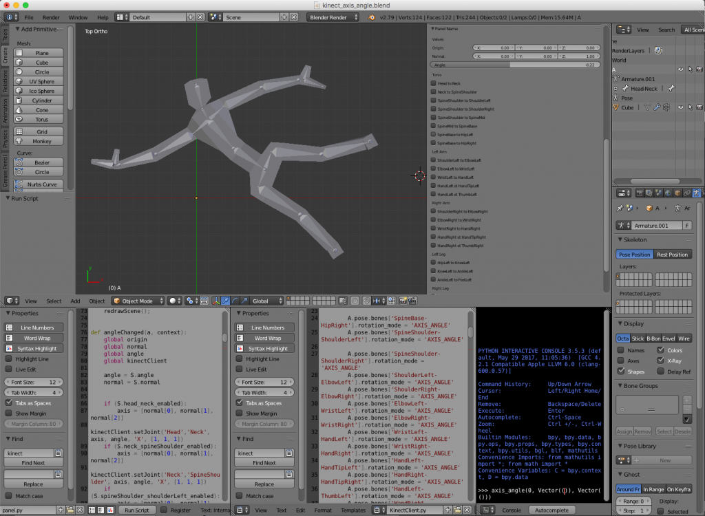
Hence, the blender file is composed basically of tree parts: the 3D body, the panel script and a Kinect interface script. The challenge was to interface the Kinect with python. For that I used two awesome libraries: pygame and pykinect2. I’ll talk about them in the next section. Unfortunately, the libraries did not like the python environment of blender and they were unable to run inside the blender itself. The solution was to implement a client server structure. The idea was to implement a small Inter Process Communication (IPC) system with local sockets. The blender script would be the client (sockets are ok in blender 😇) and a terminal application would run the server.

Python side

For the python side of things we have basically the client and the server I just mentioned. They communicate via socket to implement a simple IPC system. The client is implemented in the blender file and consists of a simple socket client that opens a connection to a server and reads values. The protocol is extremely simple. The values are sent in order. First, all the x’s coordinates of the joints, then y’s and then z’s. So, the client is basically a loop that reads joint coordinates and “plots” them accordingly in the 3D dummy doll.

The server is also astonishingly simple. It has two classes: the KinectBodyServer class and the BodyGameRuntime class. In the first one we have a server of body position that implements the socket server and literally “serves body positions” to the client. It does so by instantiating a Kinect2 object and, using the PyKinect2 API, asks for joint positions to the device. The second class is the pygame object that takes care of showing the screen with the camera image (the RGB camera) and handling window events like Ctrl+C, close, etc. It also instantiates the body server class to keep pooling for joint positions and to send them to the client.

Everything works synchronously. When the client connects to the server, it expects to keep receiving joint positions until the server closes and disconnects. The effect is amazing (see video bellow). Now, you can move in front the sensor and see the blender dummy doll imitate your moves 😀!

Motion Capture

Not long ago, big companies spent a lot of money and resources to “motion capture” a person’s body position. It involved dressing the actor with a suit full of small color markers and filming it from several angles. A technician would then manually correct the captured position of each marker. (source: https://www.sp.edu.sg/mad/about-sd/facilities/motion-capture-studio)

Now, if you don’t need extreme precision on the positions, an inexpensive piece of hardware like Kinect and a completely free software like blender (and the python libraries) can do the job!

Having fun

The whose system in action can be viewed in the video bellow. The capture was made in real time. The image of the camera and the position of the skeleton have a little delay that is negligible. That means that one can use, even with the IPC communication delay and all, as a game joystick.

Conclusions

As always, I hope you liked this post. Feel free to share and comment. The files are available at GitHub as always (see reference). Thank you for reading!!!

References

[1] – blender-kinect
[2] – PyKinect2
[3] – PyGame
1+

Wavefront sensing

Introduction

Wavefront sensing is the act of sensing a wave front. As useless as this sentence gets, it is true and we perform this action with a wavefronts sensor… But if you bare with me, I promise that its going to be one of the coolest mix of science and technology that you will hear about! Actually, I promise that it would be even poetic, since that, in this post, you will learn why the stars twinkle in the sky!

Just a little disclaim before I start: Im not an optical engineer and I understand very little about the subject. This post is just myself sharing my enthusiasm about this amazing subject.

Well, first of all, the word sensing just mean “measure”. Hence, wavefront sensing is the act of measure a wave front with a wavefront sensor. To understand what a wavefront measurement is, let me explain what a wavefront is and why one would want to measure it. It has to do with light. In a way, wavefront measurement is the closest we can get from measuring the “shape” of a light wave. The first time I came across this concept (here in the Geneva observatory) I asked myself: “What does that mean? Doesn’t light has the form of its source??”. I guess thats a fair question. In the technical use of the term measurement, we consider here that we want to measure the “shape” of the wave front that was originated in a point source of light very far away. You may say: “But thats just a plain wave!” and you would be right if we were in a complete homogeneous environment. If that were the case, we would have nothing to measure %-). So, what happens when we are in a non-homogenous medium? The answer is: The wavefront gets distorted, and we got to measure how distorted it is! When light propagates as a plain wave and it passes through an non-homogeneous medium, part of its wavefront slows down and others don’t. That creates a “shape” in the phase of the wavefront. Because of the difference in the index of refraction of the medium, in some locations, the oscillation of the electromagnetic arrives a bit earlier and some other it arrives a bit later. This creates a diferente in phase at each point in space. The following animation tries to convey this idea.

Figure 1: Wavefront distorted by a medium

As we see in the animation, the wavefront is plain before reaching the non-homogeneous medium (middle part). As it passes through the medium, it exits with a distorted wavefront. Since the wavefront is always traveling in a certain direction, we are only interested in measure it in a plane (in the case of the animation, a line) perpendicular to its direction of propagation.

In the animation above, a measurement at the left side would result in a constant value since, for all “y” values of the figure, the wave arrives at the same time. If we measure at the left side we get something like this

Figure 2: Wavefront measurement for the medium showed in Figure 1

Of course that, in a real wavefront, the measurement would be 2D (so the plot would be a surface plot).

An obvious question at this point is: Why someone would want to measure a wavefront? There is a lot os applications in optics that requires the measurement of a wavefront. For instance, lens manufacturer would like to know if the shape of the lenses they manufactured is within a certain specification. So they shoot a plane wavefront through the lens of the glass and measure the deformation in the wavefront causes by the lens. By doing that, they measure the lens properties like astigmatism, coma and etc. Actually, did you ever asked yourself where those names (defocus, astigmatism, coma) came from? Nevertheless, one of the the most direct use of this wavefront measuring is in astronomy! Astronomers like to look at the stars. But the stars are very far away and, for us, they are an almost perfect point source of light. That means that we should receive a plain wave here right? Well if we did we have nothing to breath! Yes, the atmosphere is the worst enemy of the astronomers (thats why they spend millions and millions to put a telescope in orbit). When the light of the star or any object passes through the atmosphere, it gets distorted. Its wavefront make the objet’s image swirl and stretch randomly. Worst then that, the atmosphere is always changing its density due to things like wind, clouds and difference in temperatures. So, the wavefront follows this zigzags and THAT is why the stars twinkle in the sky! (I promise didn’t I? 😃) So, the astronomers build sophisticated mechanisms using adaptive optics to compensate for this twinkling and that involves, first of all, to measure the distortion of the wavefront.

Wavefront measurement

So, how the heck do we measure this wavefront? We could try to put small light sensors in an array and “sense” the electromagnetic waves that arrives at them… But light is pretty fast. It would be very very difficult to measure the time difference between the rival of the light in one sensor compared to the other (the animation in figure 1 is like a SUPER MEGA slow motion version of the reality). So, we have to be clever and appeal to the “jump of the cat” (expression we use in Brazil to mean a very smart move to solve a problem).

In fact, the solution is very clever! Although there are different kinds of wavefront sensors, the one I will explain here is called Shack–Hartmann wavefront sensor. The ideia is amazingly simple. Instead of measuring directly the phase of the wave (that would be difficult because light travels too fast) we could measure the “inclination” or the local direction of propagation of the wavefront. Now, instead of an array of light sensors that would try to measure the arrival time, we make an array of sensors that measure the local direction of the wavefront. With this information it is possible to recover the phase of the wavefront, but that is a technical detail. So, in summary, we only need to measure the angles of arrival of the wavefront. Figure 3 tries to exemplify that I mean:

Figure 3: Exemple of measurement of direction of arrival, instead of time of arrival.

Each horizontal division in the figure is a “sub-aperture” where we measure the inclination of the wavefront. Basically we measure the angle of arrival, instead of the time of arrival (or phase of arrival). If we do those sub-apertures small enough, we can reconstruct a good picture of the wavefront. Remember that for real wavefronts we have a plane, so we should measure TWO angles of arrival for each sub-aperture (the angle in x and the angle in y, considering that z is the direction of propagation).

At this point you might be thinking: “Wait… you just exchanged 6 for 12/2! How the heck do we measure this angle of arrival? It seems that this is far more difficult then to measure the phase itself!”. Now its time to get clever! The idea is to put a small camera in each sub aperture. Each tiny camera will be equipped with a tiny little lens to focus the portion of the wavefront to a certain pixel of this tiny camera! Doing that, at each camera, depending on the angle of arrival, the lens will focus the locally plain wave to a certain region of the camera dependent on the direction its traveling. That will make each camera see a small region with bright pixels. If we measure where those pixels are in relation to the center of the tiny camera, we have the angle of arrival!!! You might be thinking that its crazy to manufacture small cameras and small lenses in a reasonable packing. Actually, what happens is that we just have the tiny lenses in front of a big CCD. And it turns out that we don’t need hight resolution cameras in each sub-aperture. A typical wavefront sensor has 32×32 sub apertures, each one with a 16×16 grid os pixels. That is enough to give a very good estimation of the wavefront. Figure 4 shows a real image of a wavefront sensor.

Figure 4: Sample image from a real wavefront sensor

Simulations!

The principle is so simple that we can simulate it in several different ways. The first one is using the “light ray approach” for optics. This principle is the one we learn in college. Its the famous one that they put a stick figure on one side of a lens or a mirror and them draw some lines representing the light path. The wavefront sensor would be a bit more complex to draw, so we use the computer. Basically what I did was to make a simple blender file that contains a light source, something for the light to pass through (atmosphere) and the sensor itself. The sensor is just an 2D array of small lenses (each one made up by two spheres intersected) and a set of planes behind each lens to receive the light. We then set up a camera between the lenses and the planes to be able to render the array of planes, as they would be the CCD detectors of the wavefront sensor. Now we have to set the material for each object. The “detectors” must be something opaque so we could see the light focusing on it. The atmosphere have to be some kind of glass (with a relatively low index of refraction). The lenses also have glass as its material, but their index of refraction must be carefully adjusted so the focus of each one can be exactly on the detectors plane. Thats pretty much it (see figure 5).

Figure 5: Setup for simulating a wavefront sensor in blender

To simulate the action, we move the “atmosphere” object back and forth and render each step. As light passes through the object, it diffracts it. That changes the direction of the light rays and simulates the wavefront being deformed. The result is showed in figure 6.

Figure 6: Render of the image on the wavefront sensor as we move the atmosphere simulating the real time reformation of the wavefront.

Another way of simulating the wavefront sensor is to simulate the light wave itself passing through different mediums, including the leses themselves and driving at some absorbing material (to emulate the detectors). That sounds kind of hardcore simulation stuff, and it kind of is. But, as I said in the “about” of this blog, I’m curious and hyperactive, so here we go: Maxwells equations simulation of a 1D wavefront sensor. To do that simulation, I used a code that I did a couple of yeas back. I’ll make a post about it some day. It is an implementation of a FD-TD (Finite Diferences in the Time Domain) method. This is a numerical method to solve partial differential equations. Basically, you set up your environment as a 2D grid with sources of electromagnetic field, material of each element on the grid and etc. Then, you run the interactive method to see the electromagnetic fields propagating. Anyway, I put some layers of conductive material to contain the wave is some points and to emulate the detector. Then I added a layer with small lenses with the right refraction index to emulate the sub-apartures. Finally, I put a monochromatic sinusoidal source in one place and pressed run. Voilá! You can see the result in the video bellow. The video contains the explanation of each element and, as you can see, the idea of a wavefront sensor is so brilliantly simple that we can simulate it at the Maxwells equation level!

DIY (physical) experiment

To finish this post, let me show you that you can even build your own wavefront sensor “mockup” at home! What I did in this experiment was to build a physical version of the Shack–Hartmann principle. The idea is to use a “blank wall” as detector and a webcam to record the light that arrives at the wall. This way I can simulate a giant set of detectors. Now the difficult part: the sub-aperure lenses… For this one, I had to make the cat jump. Instead of an array of hundreds of lenses in front of the “detector wall”, I uses a toy laser that comes with those diffraction crystals that projects “little star-like patterns” (see figure 7).

Figure 7: 1 – Toy laser (black stick) held in place. 2 – green “blank wall”. 3 – Diffraction pattern that generates a regular set of little dots.

With this setup, it was time to do some coding. Basically I did some Matlab functions to capture the webcam image of the wall with the dots. On those functions I setup some calibration computations to compensate for the shape and place of the dots on the wall (see video bellow). That calibration will tell me where the “neutral” atmosphere will project the points (centers of the sub apertures). Them, for each frame, I capture and process the image from the webcam. For each image, I compute the position of the processed centers with respect to the calibrated ones. With this procedure, I have, for each dot, a vector that points form the center to where it is. That is exactly the wavefront direction that the toy laser is emulating!

After that, it was a matter of having fun with the setup. I put all kinds of transparent materials in front of the laser and saw the “vector field” of the wavefront directions on screen. I even put my glasses and were able to see the same pattern the optical engineering saw when they were manufacturing the lenses! With a bit of effort I think I could even MEASURE (poorly of course) the level of astigmatism of my glasses!

The code is available in GitHub[2] but basically the loop consists in process each frame and show the vector field of the wavefront.

while 1
    newIcap = cam.snapshot();
    newI = newIcap(:,:,2);
    newBW = segment(newI, th);
    
    [newCx, newCy] = processImage(newBW, M, R);
    
    z = sqrt((calibratedCy-newCy).^2 + (calibratedCx-newCx).^2);
    zz = imresize(z,[480, 640]);
    
    figure(1);
    cla();
    hold('on');
    imagesc(zz(end:-1:1,:), 'alphadata',0.2)
    quiver(calibratedCy, calibratedCx, calibratedCy-newCy, calibratedCx-newCx,'linewidth',2);
    
    axis([1 640 1 480])
    
    drawnow()
end
  Bellow you can watch the vídeo of the whole fun!

Conclusions

DIY projects are awesome for understanding theoretical concepts. In this case, the mix of simulation and practical implementation made very easy to understand how the device works. The use of the diffraction crystal in toy lasers is thought to be original, but I didn’t research a lot. If you know any experiment that uses this same principle, please let me know in the comments!

Again, thank you for reading until here! Feel free to comment o share this post. If you are an optical engineer, please correct me at any mistake I might have made on this post. It does not intend to teach about optics, but rather to share my passion for this subject that I know so little!

Thank you for reading this post. I hope you liked it and, as always, feel free to comment, give me feedback, or share if you want! See you in the next post!

References

[1] – Shack–Hartmann wavefront sensor

[2] – Matlab code

2+

Uroflowmetry…

Introduction

This post is about health. Actually, its about a little project that implements a medical device called Uroflowmeter (not sure if that is the usual English word). Its a mouth full name to mean “little device that measures the flow of pee” (yes, pee as in urine 😇).

Last year I had to perform an exam called Uroflowmetry (nothing serious, a lot people do that exam). The doctor said that, as the name implies, I had to measure “how fast I pee”. Technically it measures the flow of urine that flows when you urinate. At the time I thought to myself: “How the heck will he do that?”. Maybe be it was using a very sophisticated device, I didn’t know. Then he explained to me that I had to pee in a special toilet hooked up to a computer. He showed me the special device and left the room (it would be difficult if he stayed and watched hehehehehe). I didn’t see any sign of ultra technology anywhere. Then, I got the result and was nothing serious.

The exam result is a plot of flow vs time. Figure 1 shows an example of such exam. Since my case was a simple one, the only thing that matted in that exam was the maximum value. So, for me, the result was a single number (but I still had to do the whole exam and get the whole plot). 
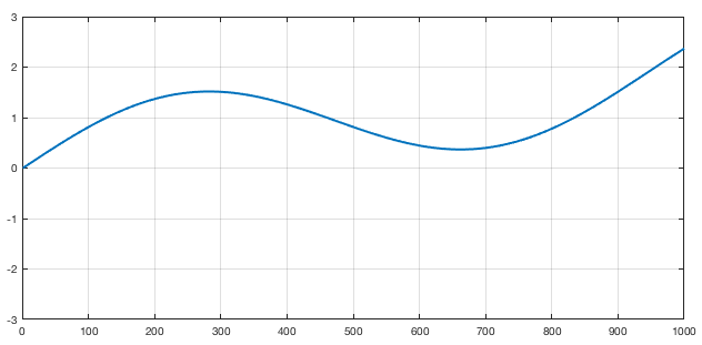
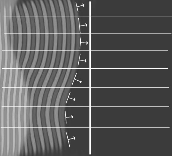
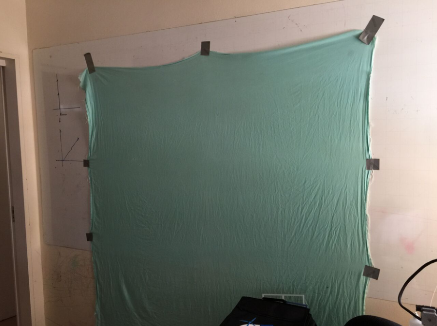
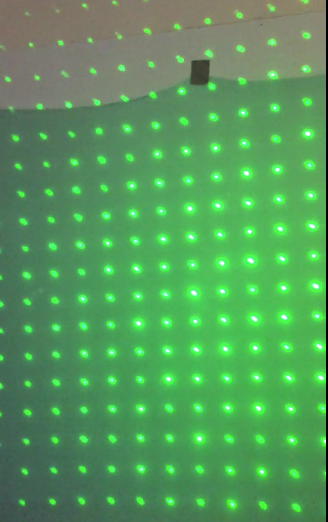
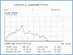
Figure 1 : Sample of a Uroflowmetry result[3] Then, he prescribe a very common medicine to improve the results and told me that I would repeat the exam a couple of days later. After about 4 or 5 days I returned to the second exam. I repeated the whole process and peed on the USD $10,000.00 toilet. This time I did’t feel I did my “average” performance. I guess some times you are nervous, stressed or just not concentrated enough. So, as expected, the results were not ultra mega perfect. Long story short, the doctor acknowledge the result of the exam and conducted the rest of the visit (I’m fine, if you are wondering heheheh).

That exam got me thinking that it (the exam) did not capture the real “performance” of the act, by measuring only one flow. I might had notice some improvement with the medication, but I wasn’t so sure. So, how to be sure? Well, if only I could repeat the exam several times in several different situations… By doing that I could see the performance in average. I thought so seriously about that, that I asked the clinic how much does the exam costs. The lady in the desk said that it around $100,00 Brazil Reais ($30.00 USD, more or less in today’s rate). That was a bummer… The health insurance won’t simply pay lots of exams for me and if I were to make, say, 10 exams, it would cost me one thousand Brazil Reais. Besides, I would still have only 10 data points.

The project

Thinking about that, maybe I could measure it myself…? Then I decided to make my own “Urine flow meter”. it would be a Hardware / Software project, so I mediately though of using an Arduino (figure 2). The trick part is to measure the flow of something like urine. The solution I came up was to make an Arduino digital scale to measure the weight of the pee while I’m peeing on it (awkward or disgusting as it sounds %-). Then, I could measure the weight in real time at each, say, 20 to 50ms. Knowing the density of the fluid I’m testing I could compute the flow by differentiating the time measurement. Google told me that the density of urine is about 1.0025mg/l (if you are curious, its practically water actually). Later on I discovered that, that is exactly how some machine works, including the one I did the exams. 
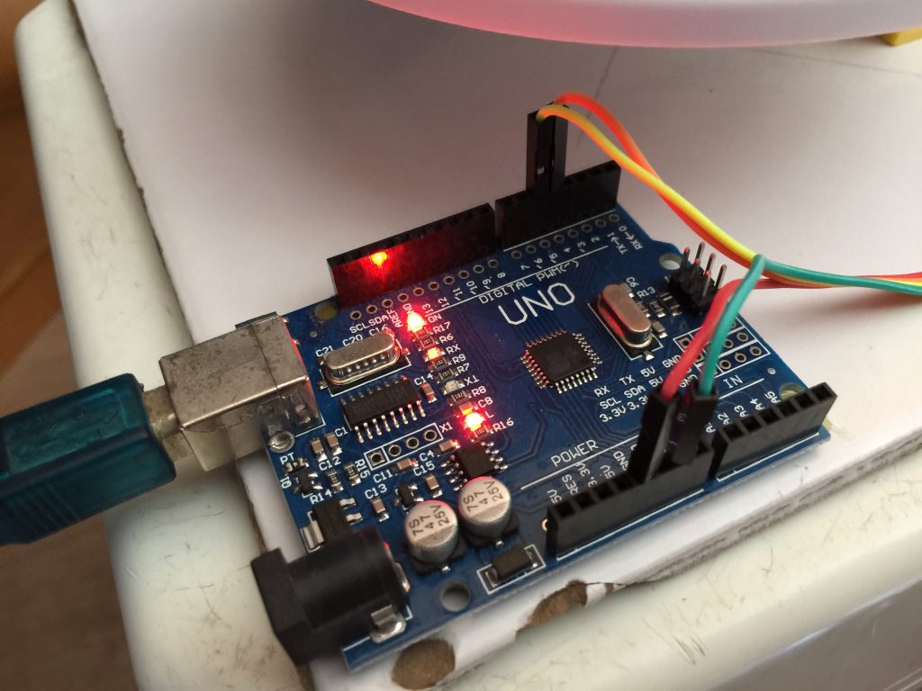
Figure 2 : Arduino board First I had to make the digital scale, so I used a load cell that had the right range for this project. The weight of the urine would range from 0 to 300~500mg more or less, so I acquire a 2Kg range load cell (Figure 3 and 4). I disassemble an old kitchen scale to use the “plate” that had the right space to hold the load cell and 3D printed a support in a heavy base to avoid errors in the measurements due to the flexing of the base. For that, I used a heavy ceramic tile that worked very well. The cell “driver” was an Arduino library called HX711. There is a cool youtube tutorial showing how to use this library [1]. 
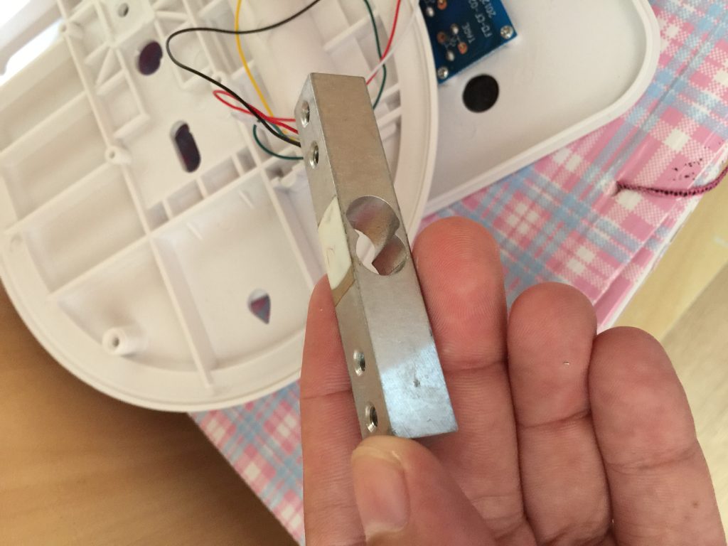
Figure 3 : Detail of the load cell used to make the digital scale. 
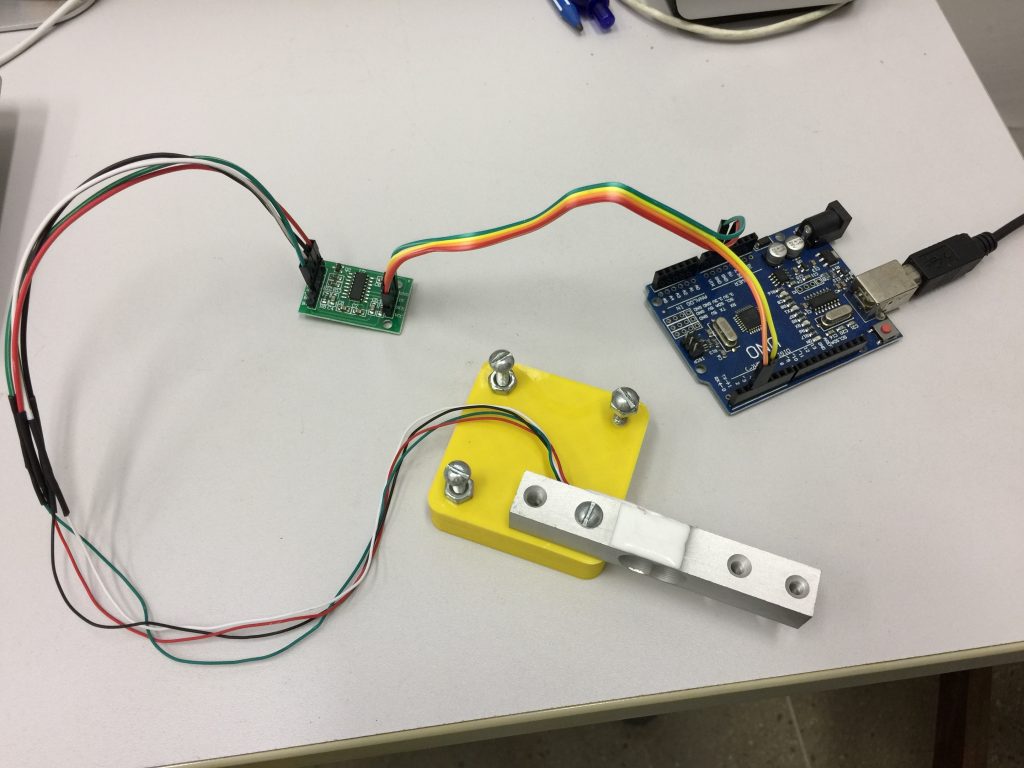
Figure 4 : Loadcell connected to the driver HX711 The next problem was how to connect to the computer!!! This is not a regular project that you can assemble everything on your office and do tests. Remember that I had do pee on the hardware! I also didn’t want to bring a notebook to the bathroom every time I want to use it! the solution was to use a wifi module and communicate wirelessly. Figure 5 shows the module I used. Its an ESP8266. Now I could bring my prototype to the bathroom and pee on it while the data would be sent to the computer safely. Figure 5 : ESP8266 connection to the Arduino board. 
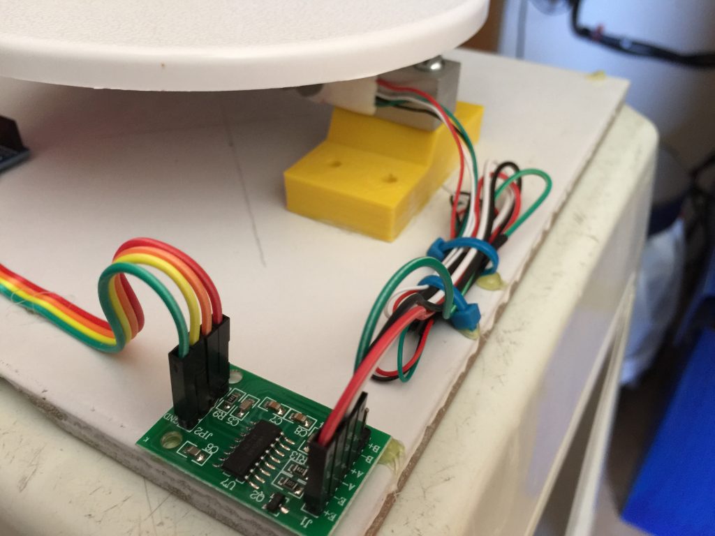
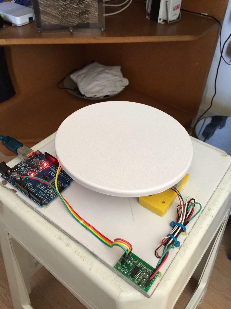
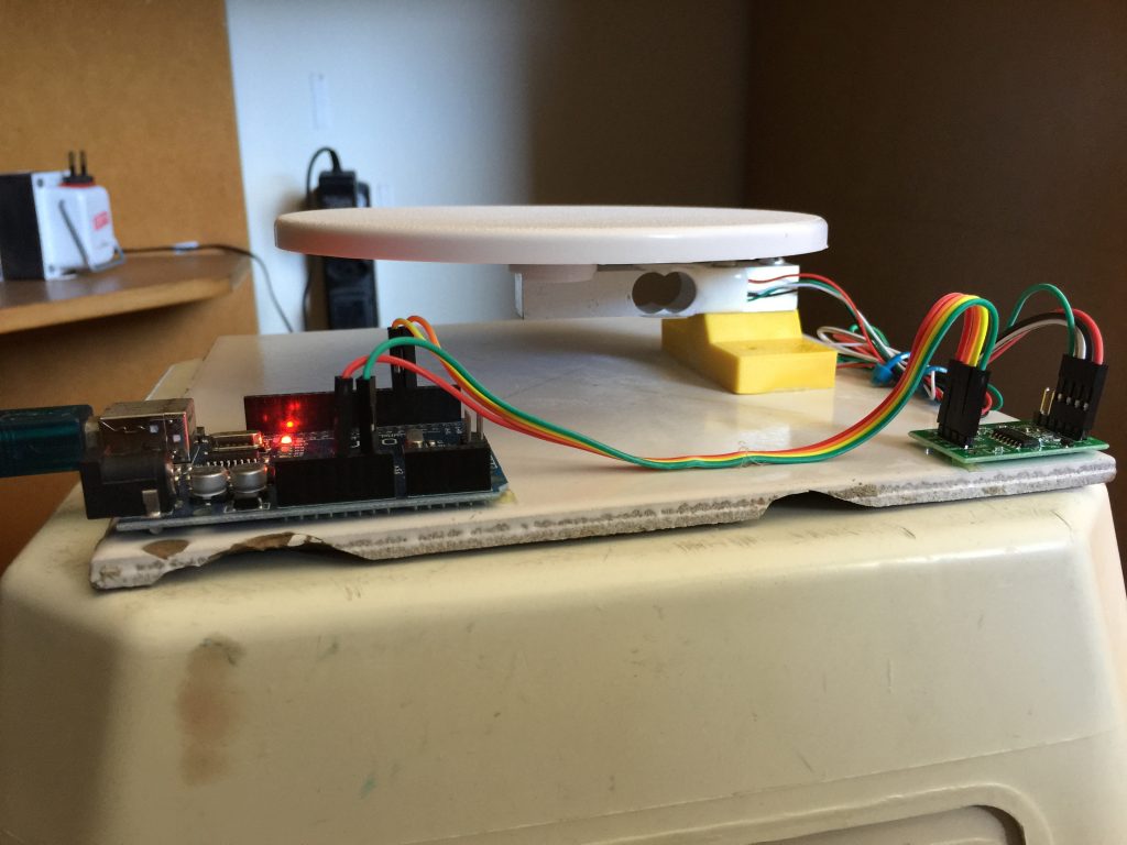
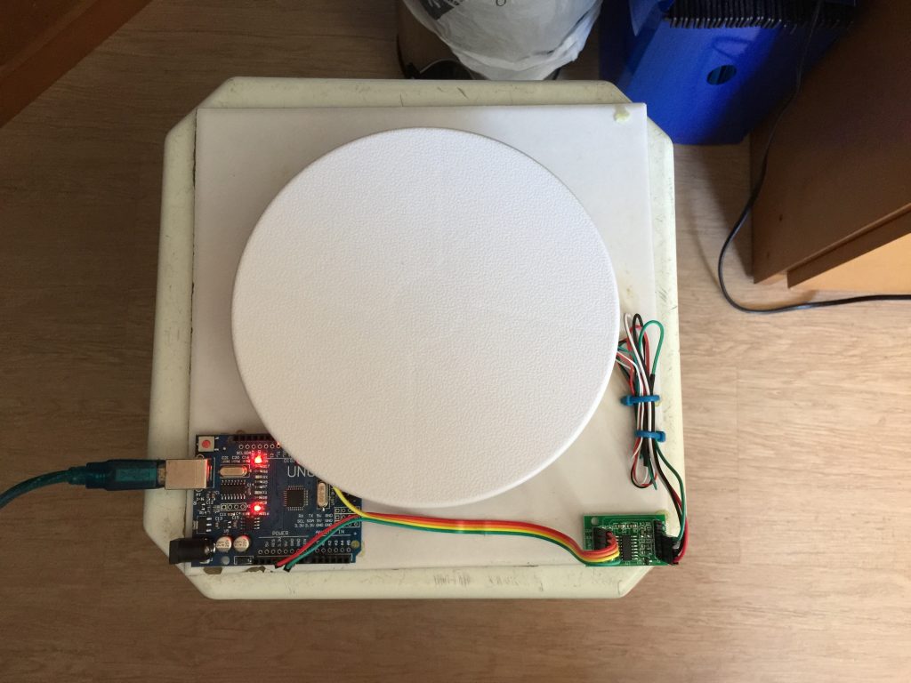
Figure 6 : More pictures of the prototype Once built, I had to calibrate it very precisely. I did some tests to measure the sensibility of the scale. I used an old lock and a small ball bearing to calibrate the scale. I went to the laboratory of Metrology at my university and a very nice technician in the lab (I’m so sorry I forgot his name, but he as very very kind) measures the weights of the lock and the ball bearing in a precision scale. Then I started to do some tests (see video bellow) The last thing to make the prototype 100% finished was to have a funnel that had the right size. So I 3D printed a custom size funnel I could use (figure 7). 
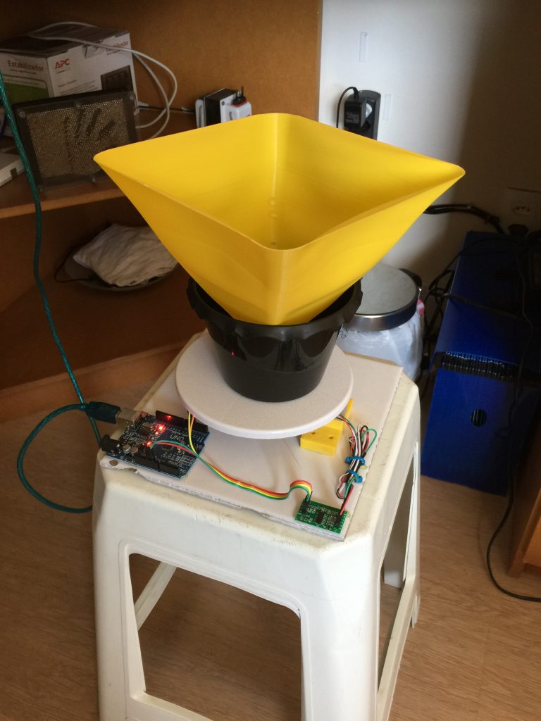
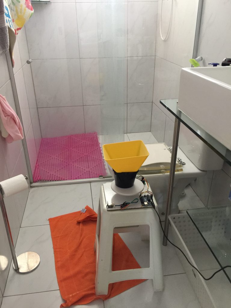
Figure 7: Final prototype ready to use Once calibrated and ready to measure weights in real time, It was time to code the flow calculation. At first, this is a straight forward task, you just differentiate the measurements in time. Something like $$ \begin{equation} f[n] = \frac{{w[n – 1] – w[n]}}{{\rho \Delta t}} \end{equation} $$ Where \(f[n]\) and \(w[n]\) are the flow and weight at time \(n\). \(\rho\) is the density and \(\Delta t\) is the time between measurements.

Unfortunately, that simple procedure is not enough to generate the plot I was hoping for. That’s because the data has too much noise. But I teach DSP, so I guess I could do some processing right 😇? Well I took the opportunity to test several algorithms (they are all in the source code at GitHub[2]). I won’t dive into details here about each one. The important thing is that the noise was largely because of the differentiation process so I tested filtering before and after compute the differentiation. The method that seemed to give better results was the spline method. Basically I got the flow data and averaged \(N\) fitted downsampled data with a spline. One sample of the results can be seen in figure 8. 
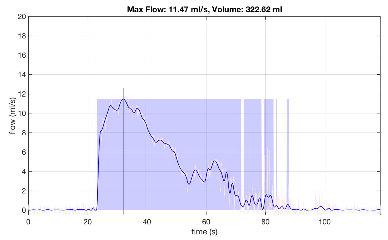
Figure 8 : Result of a typical exam done with the prototype. The blue line is the filtered plot. The raw flow can be seen in light red. The black line tells where the max flow is and the blue regions estimates the non-zero flow (if you get several blue regions it means you stop peeing a lot in the same “go”). In the top of the plot you have the two numbers that the doctor is interested: The max flow and the total volume. With everything working, it was time to use it! I spent 40 days using it and collected around 120 complete exams. Figure 9 shows all of them in one plot (just for the fun of it %-). 
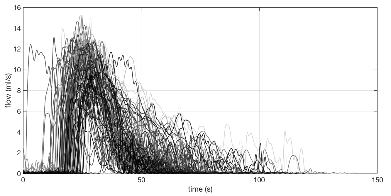
Figure 9 : 40 days of exams in one plot Obviously, this plot is useless. To just show a lot of exams does not mean too much. Hence, what I did was to do the exams for some days without the medicine and then with the medicine. Then I separated only the max flow for each exam and plotted over time. Also, I computed the mean and the standard deviation for the points with and without the medicine and plotted in the same graph. The result is showed in figure 10. 
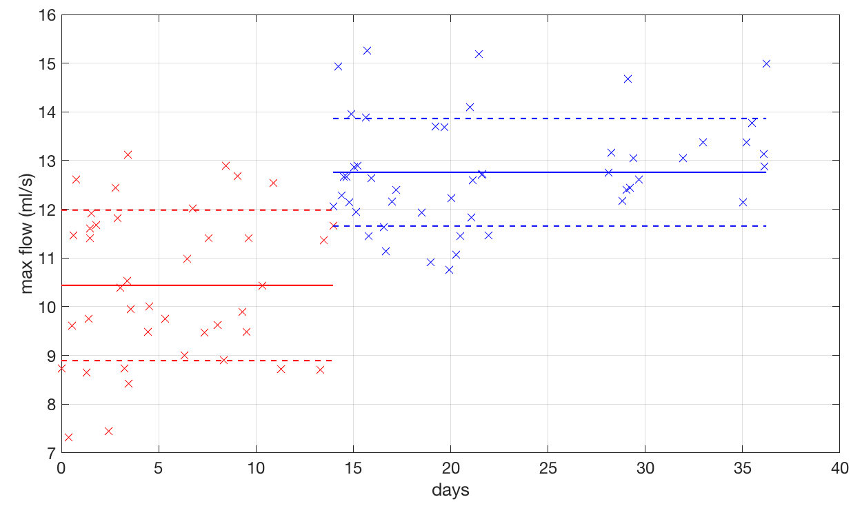
Figure 10 : Plot of max flow versus time. Red points are the results of max flow whiteout the medicine. The blue ones are the result with the medicine. Well, as you can see, the medicine works a bit for me! The average for each situations is different and they are within more or less one standard deviation from each other. However, with this plot you can see that some times, even with the medicine, I got some low values… Those were the days I was not at my best for taking the water out of my knee. On the other hand, at some other days, even without the medicine, I was feeling like the bullet that killed Kennedy and got a good performance! In the end, statistically, I could prove that indeed the medicine was working.

Conclusions

I was very happy that I could do this little project. Of course that this results can’t be used as a definite medical asset. I’m not a physician, so I’m not qualified to take any action whatsoever based on those results. I’ll show it to my doctor and he will decide what to do with them. The message I would like to transmit with it to my audience (students, friend, etc) is that, what you learn at the university is not just “stuff to pass on the exams”. They are things that you learn that can help a lot if you really understand them. This project didn’t need any special magical skill! Arduino is simple to use, the sensor and the wifi ESP have libraries. The formula to compute flow from weight is straight forward. Even the simple signal filtering that I used (moving average) got good results for the max flow value. Hence, I encourage you, technology enthusiast to try things out! Use the knowledge that you acquired in your undergrad studies! Its not only useful, its fun! Who would have thought that, at some point in my life, I would pee on one of my projects!!! 😅

Thank you for reading this post. I hope you liked it and, as always, feel free to comment, give me feedback, or share if you like! See you in the next post!

References

[1] – Load cell

[2] – Urofluximeter GitHub

[3] – NIDHI Uroflow

1+

Simulating light

Intro

In this post I’ll try to describe one of my favorite “weekend projects”. Although it took almost a month to finish, I still call it a weekend project because I never used it for any senior research.

Since I graduated in Electrical Engineering, I always wanted to simulate what I think is THE most fundamental system of equations for us (Electrical Engineers): The Maxwell’s equations. A couple of years back I finally had time to do so, and I’ll share with you the work I did. Everything is on GitHub, so if you want to try yourself, please feel free to fork the repository and play around!

In this post I’ll assume that you have at least a vague idea of what Maxwells equations are and that they describe how electromagnetic fields behave. Also, I assume that you know that light is a “moving electromagnetic field” (called electromagnetic wave). So, if we are able to describe and simulate electromagnetic waves, we can actually describe and simulate light!

Before show the simulations, let me start with a bit of explanation about the electromagnetic theory. The most obvious place to start is with Maxwell’s equations themselves: $$ \begin{equation} \begin{gathered} \nabla \cdot \vec E = \frac{\rho }{{{\varepsilon _0}}} \hfill \\ \nabla \cdot \vec B = 0 \hfill \\ \nabla \times \vec E = – \frac{{\partial \vec B}}{{\partial t}} \hfill \\ {c^2}\nabla \times \vec B = \frac{{\vec J}}{{{\varepsilon _0}}} + \frac{{\partial \vec E}}{{\partial t}} \hfill \\ \end{gathered} \end{equation} $$ These equations together with a couple of technical details like continuity constraints and boundary conditions, simply describes ALL physics related to electromagnetic fields. That includes radio waves, light, electricity, magnetism and etc. It is not the goal of this post to talk about Maxwell’s equation themselves, but rather about its solutions. In particular, about numeric solutions. Also, I do not intend to go deep into the theory of the simulation method, but rather to show its potential and encourage you to try! This post is not a tutorial, but I’ll try to point you in the right direction if you want to do it yourself. Also, I have to assume that you know some Calculus (at some not so basic level, I’m afraid).

First of all, lets understand what a solution to Maxwell’s equation means. Any equation that describes a physical phenomenon is a kind of mathematical description of that phenomenon. For instance, the famous Newton’s equation \(F = m\,a\) tells us that if you have a mass of \(10Kg\) and it is accelerating with an acceleration of \(2m/s^2\), there should be a force of \(20N\) being applied to the mass. In the same way, Maxwells equation tells us that if a medium has electrical permittivity \(\varepsilon_0\), the charge density is \(\rho\), etc, etc, then the electric and magnetic fields MUST be such that the divergent of the electric field is \(\rho / \varepsilon_0 \) and etc. For instance, Maxwell’s equation directly states that, whatever the situation is, the divergent of the magnetic field is zero. And so on…

So, that means that if you know the environment, in another words, you know how its permittivity, permissively, charge density, etc are distributed, you can predict how the electromagnetic fields will behave on this environment. In order to do that, you solve Maxwell’s equations to find \({\vec E}\) and \({\vec B}\).

It turns out that Maxwell’s equations, although they have a “simple” look, they are kind of “extensive” in the sense that the electric and magnetic fields have each one 3 components x, y and z and each component varies in space and time. Also they are partial differential equations, which involve all the derivatives of the solution either in x, y, z and t! So, to solve the Maxwell’s equation mean to find 6 functions of 4 variables. In general that is not possible to do analytically except in special cases. Hence, we have to appeal to numeric solutions. There are tons of methods for numerically solve a partial differential equation. In this post we will talk about the FD-TD method (due to Kane S. Yee) or method of Finite Diferences in the Time Domain (sometimes called Yee method). The method itself is pretty straightforward and, as all numerical method, it begins by exchanging the functions themselves by a grid of discrete values. As I mention, I won’t go deep into the method itself, but I’ll try to give an idea of how it works. Another important thing: I implemented the 2D version of the FD-TD method. So, the simulation will consist in a fields that is the same in the z direction form minus infinity to infinity. Unfortunately, cool things like polarization of light won’t be possible here (by definition, a 2D wave is aways polarized). But don’t worry, I promise that you can still have A LOT of fun with this apparently frustrating limitation.

In summary up to now, we will solve Maxwell’s equation numerically using the FD-TD method. So, what does this mean in practice? That means that we are going to divide our environment in a grid (2D for our case) and set each point on the grid with objects like conductors, sources, walls and etc. After that, we compute the electric and magnetic field on each point on the grid at each instant of time. The result is that, hopefully, we are going to see an “animation” of the fields interacting with our small “world”. Figure 1 tries to show a possible setup for a simple simulation.

Figure 1: 2D grid with a source of electric field and some objects with different permittivities conductivities.

The FD-TD method itself[1] is well described in lots of places, books, etc. But if I were to recommend a place where you can learn very well, I would recumbent the youtube channel CEM lectures[2]. I saw some videos on FD-TD method and they are really good!

Finite-Difference Time-Domain method

Here I’ll briefly describe the idea behind the method itself. The idea is based on the approximation of the derivatives by differences divided by the step. This principle is very well suited for ordinary differential equations that approximates derivatives in time. $$ \begin{array}{l} \frac{{dx(t)}}{{dt}} \approx \frac{{x(t + \Delta t) – x(t)}}{{\Delta t}}\\ x(t + \Delta t) \approx x(t) + \frac{{dx(t)}}{{dt}}\Delta t \end{array} $$ The time portion of the method is called “leapfrog” step and is based on this idea of integrating the time derivative. As you can see, it provides a way of computing the next value of the function \(x(t+\Delta t)\) used on its current values \(x(t)\). This is also called Euler’s method. In the FD-TD, method, the time derivative also depends on the derivative in space. Since we will focus on the 2D version, one of the fields (either the electric or the magnetic) will be the same in the z direction (z here is arbitrary). Depending on which you choose to be constant in the z direction, we call the setup as TE or TM (transverse electrical or transverse magnetic). All derivatives in z will be zero for the chosen field and it will not have x and y components. The other field then won’t have the z coordinate, only x and y. The reason this happens is that the curl of the field is a intrinsic 3D operation. In fact, although we simulate in a 2D world (even 1D for that matter) the fields are still three dimensional entities. What happens is that some components are zero or remans constant from minus infinity to infinity.

There is still one “trick” that must be done in the numerical setup for the FD-TD method. Since se have relationships with the curl of the fields, we have to consider the resulting vector to the in the “center” of the diferences. So, in the TM approach, the electric field have to be in the center of the magnetic fields (and no magnetic field must be present). So, for the method to work, we have to “stagger” the grid, moving it “half step” in x and y for one of the fields. So, this produces a grid for the electric field that is halfway displayed from the magnetic field. This is important for the assignment of the spacial indices for the electric and magnetic fields. Figure 2 shows the staggered grid that represents the electric and magnetic fields in the TM configuration.

Figure 2: Staggered grid for the electric and magnetic fields in the TM scenario

As you can see, the staggered grid trick forces the electric field be always surrounded by magnetic field. This is perfect to approximate the curl equation. As a practical note, the “half” spatial step is just a notation stunt. In the end, in the computer, it will be all integer indices. This notation makes it easy to locate each field in the discrete approximation.

Since we dealing with the 2D simulation, this simplifies the difference equations for the whole set of Maxwell’s equations. In fact we end up with this set of difference equations[3] bellow. Observe that the order of computation here matters… This is a technical detail that has to do with the stability of the method. Since we are integrating, if we do not compute things right, we might generate a systematic error in one of the fields, causing it to integrate more then necessary and blow up the values. $$ \begin{array}{l} {H_x}\left[ {m,n + \frac{1}{2},q + \frac{1}{2}} \right] = {H_x}\left[ {m,n + \frac{1}{2},q – \frac{1}{2}} \right] – \\ \frac{{\Delta t}}{{\mu \Delta y}}\left( {{E_z}\left[ {m,n + 1,q} \right] – {E_z}\left[ {m,n,q} \right]} \right) \end{array} $$ $$ \begin{array}{l} {H_y}\left[ {m + \frac{1}{2},n,q + \frac{1}{2}} \right] = {H_y}\left[ {m + \frac{1}{2},n,q – \frac{1}{2}} \right] + \\ \frac{{\Delta t}}{{\mu \Delta x}}\left( {{E_z}\left[ {m + 1,n,q} \right] – {E_z}\left[ {m,n,q} \right]} \right) \end{array} $$ $$ \begin{array}{l} {E_z}\left[ {m,n,q + 1} \right] = \frac{{2\varepsilon – \rho \Delta t}}{{2\varepsilon + \rho \Delta t}}{E_z}\left[ {m,n,q} \right] + \\ \frac{{2\varepsilon }}{{2\varepsilon + \rho \Delta t}}\left( \begin{array}{l} \frac{{\Delta t}}{{\varepsilon \Delta x}}\left( {{H_y}\left[ {m + \frac{1}{2},n,q + \frac{1}{2}} \right] – {H_y}\left[ {m – \frac{1}{2},n,q + \frac{1}{2}} \right]} \right)\\ – \frac{{\Delta t}}{{\varepsilon \Delta y}}\left( {{H_x}\left[ {m,n + \frac{1}{2},q + \frac{1}{2}} \right] – {H_x}\left[ {m,n – \frac{1}{2},q + \frac{1}{2}} \right]} \right) \end{array} \right) \end{array} $$ Now let me just comment a bit about the notation. \(E_z[m,n,q]\) is the electric field in z at index m and n in the grid at instant q in time (same for the other fields). \(\rho\), \(\epsilon\) and \(\mu\) are the conductivity, permittivity and permeability of the medium. Although not explicitly in the equations, each one also depend on the position on the grid m and n (\(\rho[m,n]\), \(\epsilon[m,n]\) and \(\mu[m,n]\)). The deltas are the spacing for the discretization in space and time.

Actually, the “algorithm” of FD-TD is pretty much only that! Its a loop that keeps updating the fields according to those equations. The heart of the implementation is the step that do that update. The code is as simple as this one

function [Ezo, Hxo, Hyo] = leapFrog2D(Ezi, Hxi, Hyi, parameters)

    Ezo = Ezi;
    Hxo = Hxi;
    Hyo = Hyi;


    c1 = parameters.c1;
    c2 = parameters.c2;
    c3 = parameters.c3;
    c4 = parameters.c4;
    dx = parameters.dx;
    dy = parameters.dy;
    boundary = parameters.boundary; 
    wire = parameters.wire;
    
   
    Nx = size(Ezi,1);
    Ny = size(Ezi,2);
    
    j_p_0_E = 1:Nx-1;
    j_p_0_E = 1:Ny-1;

    i_p_1_E = 2:Nx;
    j_p_1_E = 2:Ny;

    i_p_0_H = 1:Nx-1;
    j_p_0_H = 1:Ny-1;

    i_p_1_H = 2:Nx;
    j_p_1_H = 2:Ny;

   
    % transverse electric
  
    Ezo(i_p_1_E, j_p_1_E) = c1(i_p_1_E, j_p_1_E).*Ezi(i_p_1_E, j_p_1_E) + c2(i_p_1_E, j_p_1_E).*(  ( wire(i_p_1_E, j_p_1_E).*Hyi(i_p_1_E, j_p_1_E) - wire(i_p_0_E, j_p_1_E).*Hyi(i_p_0_E, j_p_1_E) )/dx - ( wire(i_p_1_E, j_p_1_E).*Hxi(i_p_1_E, j_p_1_E) - wire(i_p_1_E, j_p_0_E).*Hxi(i_p_1_E, j_p_0_E) )/dy   );

    Hxo(i_p_0_H, j_p_0_H) = Hxi(i_p_0_H, j_p_0_H) + c3(i_p_0_H, j_p_0_H).*(   ( wire(i_p_0_H, j_p_0_H).*Ezo(i_p_0_H, j_p_0_H) - wire(i_p_0_H, j_p_1_H).*Ezo(i_p_0_H, j_p_1_H) )/dy   );
    Hyo(i_p_0_H, j_p_0_H) = Hyi(i_p_0_H, j_p_0_H) + c4(i_p_0_H, j_p_0_H).*(   ( wire(i_p_1_H, j_p_0_H).*Ezo(i_p_1_H, j_p_0_H) - wire(i_p_0_H, j_p_0_H).*Ezo(i_p_0_H, j_p_0_H) )/dx   );
end
The whole code is in GitHub[4]. As you can see, its the implementation of the update equations. This function keeps being called in a loop. The “heavy duty” coding (not so heavy actually) on this project was the “surroundings”. Things like configuring the grid with permittivities, conductivities, etc. Also, I have the code to generate the vídeo files, to put some nice coloring, to layer everything on images (to make the vídeo frames), among other minor details. One of the interesting things in the complete implementation is the use of GPU (CUDA) to speed up the computations. That REALY makes the difference.

Having fun with it

With the implementation ready, it was time to have fun! I implemented a couple of auxiliary functions to “shape” the 2D world that will be simulated. They are functions to make basic shapes like squares, circles, lenses, and etc. With that, I created a lot of configurations that I will share here. For each one, I’ll put the vídeo of the simulation and comment on it. In all of the vídeos that you will see bellow, there is a basic setup. It consists of a source of electric field positioned, in general, on the left side of the grid. In the surrounding of the grid, there is what looks like a saw tooth border. That border is made of conducting material and aim to absorb the waves that reaches the border. If we do not use that object, the waves will perfectly reflect of the walls, creating a mess of waves inside the image. There is a more elegant solution to this problem called PML, or Perfect Matched Layer, but I didn’t implement that yet. The fields will be represented by a layer of red and blue colors. For visual convenience, I only plot the electric field intensity (red means positive values and blue, negative).

A simple pulse of light

The first example is a kind of “hello world” of optics simulation. It consists only in the basic setup I mentioned where the source of electric field is just a “burst of light”. It is like a little lamp that lights on and off (very very quickly for the time scale of the simulation). The closest real situation that I can compare this simulation is a laser pulse. Its a short pulse that has a very well defined frequency.  

Single lens simulation

Here is where the fun begins. Now we have an example of a wave simulation of light passing through a lens and being focused on one “point”. The lens is just a region on the grid with a permittivity larger than one (its a lens for the electric field). The word “point” there is between quotation marks because, opposed to most of us learn in school optics, there no such thing as focal “point”. Because the wave nature of light, we can’t have a “delta function” as part of the solution of a set of first order partial differential equation (like Maxwell’s equations). Instead, we have a point where we reach a “limit” called diffraction limit of light. The size of this point depends on things like wavelength and focal distance. So, if some day you hear about a 1Giga Pixel camera inside a small smartphone, be caution! Someone is breaking the laws of nature and J. C. Maxwell is shaking like crazy on his thumb! 😂

Another interesting thing that you can learn with this kind of simple example is that there is no such thing as “collimated” light! In another words, lasers are not perfect cylinders of light. They diverge! The difference is that the laser diverges as little as possible keeping the solutions for the wave propagation valid.

Actually, the subject of wave optics is a discipline in on itself. One cool thing that you can learn is that, at focal distance of the lens, instead of a “point” of light, we actually see the Fourier transform of whatever passes through the aperture as plane a wave!!!😱 For this example, since we have more or less a “plain” wave and the aperture is like a “square” (at least in 2D), what we see in the focal plane is the Fourier transform of the square pulse (a sinc function). If you look carefully at the focal distance of the lens, you can notice the first “side lobes” of the sinc forming along the y direction! This might become a new post entitles some thing like: “How to compute Fourier transforms with a piece of glass” %-).

Ha, I can’t forget to mention the “power density loss” that happens with electromagnetic waves. You can clearly see that, as the wave propagates from the source, the amplitude decays (the waves become fainter in the vídeo). Thats because the energy of the wave have to be distributed in a larger area. So, as the wave becomes “bigger” when it leaves the source, its amplitude have to decrease. Its like each “ring” of electric field has to have the same “volume”. So, small rings can be taller than the larger ones.  

FSS

This one is a 2D version of a very interesting subject in electromagnetic theory that I learned with a very good professor and friend of mine, Antonio Luiz: Frequency Selective Surface. FSS’s are surfaces that “filters” the wave that hits them by reflecting part of the wave and transmitting the rest. They are amazingly simple to construct (no so much to tune) because they are basically a conductive surface formed by periodic shapes. In reality (3D world) they are an infinite plain made of little squares, circles, etc. The most common FSS in the world is the microwave door. It is just a metal screen made with small holes. That screen lets high frequencies pass (light) and reflect the low frequencies (the microwave that is dangerous and heat the food). So, thats why you see your food but at the same time you are protected from the microwaves.

So, in a sense, this vídeo is nothing less than the simulation of a 2D microwave oven 😇! In the simulation you first see a pulse of high frequency content. It passes through the FSS (dashed line in the middle), reflecting some part. Then a second pulse of much higher wavelength is shot. This time, you barely see any wave transmitted, as this configuration is a high-pass FSS filter.  

Antireflex coating and refraction

Now we will visit two subjects at once. The first is a simple one, but very cool to check with a simulation: Refraction of light. As we all learn in school optics, when light passes from one medium to another (with a different index of refraction), it refracts. “Refraction of light” is a phenomenon that have a couple of implications. When studying optics in school, we learn that light “bends” when reaches a different medium, changing the direction of propagation. We represent that with a little line that changes the angle inside the second medium. Just a side note: I think this representation of the light as a line is very very misleading for the students… If there is one thing that light is NOT, is a line. Its like representing time as a strawberry on physics 101… Anyway, the other thing that happens in the refraction of light is that its speed decreases in the medium with larger index of refraction. That is exactly what you see in this simulation. If you look carefully, the blue “glass” is 45 degrees tilted and the “light” comes out of the hole with the small lens horizontally. Due to refraction, the light “ray” inside the blue region is tilted down. Moreover, if you look even more carefully, you can see that inside the blue region, the distance between the red and blue part of the wave are smaller than it is outside. That mens that the wavelength is smaller inside the medium with larger index of refraction. The effect is that the light must travel slower to cope with the fact that, outside, the wave keeps coming with the same speed. Actually, in the simulation you can see that the propagation slows down inside the “glass”.

The second concept present in this simulation is the concept of anti-reflex coating. This is a process that optical engineers have to do when fabricating lens, or even sheets of glass, to avoid reflection on the surface when light hits it. In the simulation, the upper “glass” has no treatment and the lower does. Because of that, you can clearly see that, when the wave hits the object whiteout the coating, there is a reflected wave going up, while in the surface with the coating, no wave is reflected.  

Optical fiber

Every body must have heard about optical fibers… Then are small hair sized tubes made of glass (in general) that “conduct” light. They are based on another principle that we learn in school optics: Total internal reflection. This is like an “anti-refraction” effect. It happens when light hits an interface but the second medium has a index of refraction that is smaller then the one the light is propagating on. So the idea is that you shoot light into a tube and it will be confined inside because the outside medium (air or some other) has a index of refraction smaller then the one on the fiber. The light will them keep reflecting until reached a special end where it can be extracted.

The video is practically self explanatory %-). We have two fibers. The cool thing about this is that, due to the 2D nature of the simulation, this fiber is not an actual “tube”. Rather, it is an infinite retangular region. But, so is our wave! Hence, the net effect is that we have the same behavior of internal reflection as an real optical fiber! Moreover, depending on the wavelength of our source, the propagation won’t be like a “reflecting” ray. Instead, if we have a larger wavelength source compared to the fiber diameter, the light will propagate like blobs of light. You can see that in the first fiber. There, the light seems to propagate in a straight path. That is the famous “mono-mode fiber”! The multimode fiber is the second one, where you have the reflection very well identifiable.  

Crystal photonics wave guide

This one was fun to make. Not because of its structure, that is relatively simple, but because the “name of the simulation” sounded very sophisticated. The history of this one is more or less as follows; I was browsing the internet, probably reading the news, when I came across a paper[5][6] that talked about “Electro-optical modulation in two-dimensional photonic crystal linear waveguides”. I clicked in the pdf just out of curiosity and I came across an image that looked a lot like the waves I use to simulate. But the paper talked about a complex effect that light can present when you build a special microscopic structure for it. They use the same technique used to build microchips to build a lattice of silicon “crystals”. This lattice seems very simple in shape. They were just circles equally spaced with a “path” of missing circles. The paper said that, if you construct the circles with the right index of refraction and the right size (of the order of the wavelength of light that you want to use), you could “guide” the light in the path of missing crystals. Wow!! I though with myself: “Damn! That might be one of those super mega complex crazy math models that express a very special behavior of light in a ultra specific situation”. But then I remember that it had the word “linear” in the title of the paper. Well, I decide to loose 15min of my life to open photoshop and draw the same shape they used in the paper. Imported the image on the FD-TD simulator, followed more or less the rule for deciding the permittivity and wavelengths used and… Well, I couldn’t be happier! The video will speak for itself 😃! Simple as that! With no expertise whatsoever in the area of photonics, I was able to repeat the result of a paper that I spent 15min on…  

Wavefront sensor

One subject in optics that deserves its own post is the topic of “Wavefront sensing”. I’ll do this post for sure. For now, let me share only the FD-TD simulation of it, since we are in the topic of FD-TD. I can’t say much about this simulation other than it is simulating a device that really exists and is used to measure the “shape” of the light that arrives at it!!! I’ll let you curious (if you like this sorts of things %-) and I will talk about this simulation and the device itself in a separated post. Stay tuned!  

Optical circuit

Finally, just for the heck of it, let me show a simulation with a larger setup. This is just to show that, with the simulator implemented, to simulate a complex environment is just a matter of setting it up. So, In this one, the bended fiber optics and the waveguide are images that I made in photoshop and imported as permittivities in the simulator! So, this is it… Is THAT easy to simulate a complex environment. Draw it in paint if you like, and use as parameters for the simulator %-). The vídeo is also self explanatory at this point. We have the source of light as usual, an optical fiber and a waveguide that guides the light pulses!  

Going a bit further with the fun

Finally (this is the last one, I promise) let me share the tipping point of my excitement (up to now) with FD-TD. All the vídeos you saw up to now are “standard” in the sense that everyone that works with FD-TD do small animations like those. Even the colors are kind of a tabu (red and blue). So, I wanted to do something different. But what could be different in this kind of animations? Them I turned to a software that I love with all my heart: Blender. Its a 3D software (like AutoCAD, but way cooler %-). One of the coolest things of Blender is that you can implement scripts in python for it. So, what if I, some how, were able to communicate Matlab with Blender and “render” the animations on its cool 3D environment? And thats what I did… I set up a simple 3D scene and plotted the electric field as a Blender object and, at each frame, rendered the screen. I even put a fake voltmeter to fakely measure the “source amplitude” heheheheh. I think it is very cute to see the little waves propagating on the surface of the object.

Even further…

Since I had the 3D file for the frames, why not to 3D print one them? That, I would guess, is original… I have a feeling that I was the first crazy person in the planet to 3D print the solution of Maxwell’s equation on yellow PLA… See figure bellow %-) 
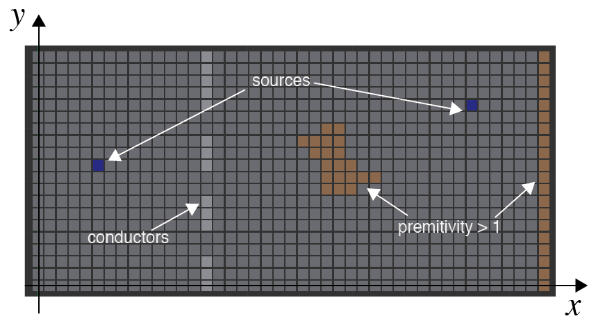
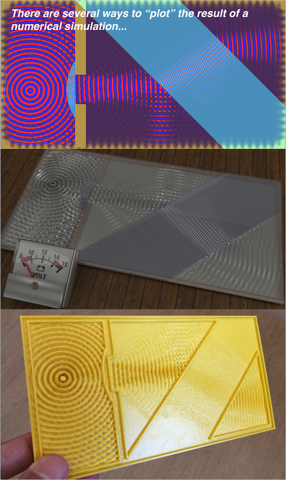
Figure 3: The ways you can visualize the solution to Maxwell’s equation for a boundary condition involving a source, a lens and a tilted glass block.  

Conclusions

It is amazing how much knowledge can be extracted from such simple implementation (a loop that calls a function with a simple update rule). The heart of the FD-TD algorithm does not involve while loops or if statements. There is no complex data structures, no weird algorithms and crazy advanced math calculation in the code. Just something like \(E[n+1] = E[n] + …\)… In the end, the algorithm itself, uses only the 4 mathematical operations. This is the power of Maxwell’s equation. Obviously, we put some considerable effort in the “boundary conditions” by organizing the permittivities, conductivities, etc. But that is a “drawing” effort. The big magic happens because we have such special and carefully crafted relations in the Maxwell’s equations. Nature is REALY amazing!

As I said in the beginning of this post, this is one of my favorite “weekend project”. Not only because I always wanted to simulate Maxwell’s equations themselves. Actually, after I started to play with it, I learned a lot of what is considered very complicated concepts without even notice that I was learning it! One situation that I will aways remember is that, after I arrive in my second post-doc in the Genevra Observatory, I was very scary that I would not understand the optics part of the project. But for my surprise, as I started hearing terms like “diffraction limit”, “point spread function”, “anti-reflex coating”, “sub-aperture” and etc, I began to associate those terms to stuff that I actually saw in my situations, hence knowing exactly what they were!!! That is a feeling that I, as a professor, can’t have enough of.

Thank you for reading this post. I hope you liked reading it as much as I liked writing it! As aways, feel free to comment or share this post as much as you want!

References

[1] – Finite-Diference Time-Domain method

[2] – CEM Lectures

[3] – John B. Schneider, Understanding the Finite-Difference Time-Domain Method

[4] – FD-TF GitHub

[5] – Electro-optical modulation in two-dimensional photonic crystal linear waveguides

[6] – Waveguide Bends in Photonic Crystals

1+

WhatsApp memes with hidden beauty!

Intro

I love internet memes. They provide a funny way to convey a message or an idea. As a professor, I cherish all didactic mechanisms and anything that easy the acquisition or fixation of ideias and concepts. In fact, I find memes to be a very useful didactic tool. I might make a post only about didactic memes in the future. Right now I want to talk about one specific meme that, although not didactic at first glance, hides a cool and rather formal math concept without most people realizing it (except for the author, I bet!).

The fun…

So, here we go. This is the meme. Maybe you already received it via WhatsApp (I did %-). The beginning of the meme is, as you most probably know, those famous “linear system of equations with emojis as variable names”. Fun fact about those memes: Most of them present systems that are quasi triangular, and hence, very very easy to solve. Anyways… In general, they give you 3 or 4 equations with right hand side values and asks you to compute a 4th or 5th equation that is, in general, another linear combination of the variables.

In the case of the meme in this post, the 4th equation is nothing like a linear combination of the values. In fact, it is some weird looking complex mathematical aberration! This is where the meme ends for most people. The funny in that meme is that nobody can solve it. So, you suppose to send that to your annoying friend that keeps sending regular linear combination meme to you, solving all of them to show that he is a math genius.

Well… It turns out that the 4th equation is solvable! Moreover, it involves the integral of a very famous function (\(sinc(x)\)) which has a very elegant solution for when the limits involves infinity and zero. And yet more, that is despite the fact that it have no closed form solution for arbitrary limits.

Translating the emojis to variables, we arrive at the following integral $$\int\limits_{2b – a}^\infty {\frac{{a\sin (x)}}{{c\,x}}{\text{d}}x}$$ which, with numbers (solving the trivial linear system of emojis), becomes $$ 5\int\limits_0^\infty {\frac{{\sin (x)}}{x}{\text{d}}x} $$ The goal of this post them, is to solve this integral using almost all steps as purely algebraic manipulations. We are also going to use rules of calculus too, obviously. Moreover, we will have to go though some complex numbers too (yes, we go that deep in a innocent internet meme). Lets now solve the sinc function integral.

We start by acknowledging that \(sin(x)/x\) is a function with an anti-derivative that is very hard to find. If only we had something to relate easier functions to integrate (like exponentials)… But wait, we have! The first exponential that we can exchange, is the sine function (as you probably already guessed). So lets use Euler’s identity: $$ \sin (s) = \frac{{{e^{sj}} – {e^{ – sj}}}}{{2j}} $$ Although this is not a pure algebraic step, I will save the Taylor expansion prove of this one, for it is a very, very known relation.

The second one is the “jump of the cat” as we say in my country. I found that in an awesome StackExchange answer[1]. It has to do with the Laplace transform of the step function $u(t)$. In short, it states that the Laplace of the step function is the inverse function. The relation has a simple one line of proof as $$ L\left\{ {u(t)} \right\} = \int\limits_0^\infty {{e^{ – st}}{\text{d}}t} = \left. {\frac{{{e^{ – st}} – {e^{ – st}}}}{{ – s}}} \right|_0^\infty = \frac{1}{s} $$ Hence $$ \int\limits_0^\infty {{e^{ – st}}{\text{d}}t} = \frac{1}{s} $$ Holly butter ball! Now we can relate the inverse function with the exponential 😱. I wish I could use emojis on technical papers. They convey so much of the authors wonder when some beautiful math trick is used… %-)

Now lets change the names of the variables to $$ \int\limits_0^\infty {\frac{{\sin (s)}}{s}{\text{d}}s} $$ which makes our original sinc integral to become $$ \int\limits_0^\infty {\int\limits_0^\infty {{e^{ – st}}\frac{{{e^{sj}} – {e^{ – sj}}}}{{2j}}{\text{d}}t} {\text{d}}s} $$ Ok, the \(s\) integral is easy and here are the steps to solve it (it’s an exponential integral) $$ \begin{gathered} \frac{1}{{2j}}\int\limits_0^\infty {\int\limits_0^\infty {{e^{ – s(t – j)}} – {e^{ – s(t + j)}}{\text{d}}s} {\text{d}}t} \\ \frac{1}{{2j}}\int\limits_0^\infty {\left. { – \frac{{{e^{ – s(t – j)}}}}{{t – j}} + \frac{{{e^{ – s(t + j)}}}}{{t + j}}} \right|_0^\infty {\text{d}}t} \\ \frac{1}{{2j}}\int\limits_0^\infty { – \frac{{{e^{ – \infty (t – j)}}}}{{t – j}} – \frac{{{e^{ – \infty (t + j)}}}}{{t + j}} + \frac{{{e^{ – 0(t – j)}}}}{{t – j}} – \frac{{{e^{ – 0(t + j)}}}}{{t + j}}{\text{d}}t} \\ \frac{1}{{2j}}\int\limits_0^\infty {\frac{1}{{t – j}} – \frac{1}{{t + j}}{\text{d}}t} \end{gathered} $$ Now we have a integral in \(t\). This one is a lot of fun. Lets start by separating the two integrals as $$ \begin{gathered} \frac{1}{{2j}}\int\limits_0^\infty {\frac{1}{{t – j}}{\text{d}}t} – \frac{1}{{2j}}\int\limits_0^\infty {\frac{1}{{t + j}}{\text{d}}t} \end{gathered} $$ and do the following substitution. $$ \begin{gathered} {u_1} = t – j \\ d{u_1} = dt \\ {u_2} = t + j \\ d{u_2} = dt \\ \end{gathered} $$ Now we foresee that we are going to have some trouble with this infinity and the logs that will appear… Hum… Lets be careful (to not say formal) and wrap that around a limit. We deal with the limit later. Ok, so we have the following inverse integral (with is also simple to solve inside the limit) $$ \begin{gathered} \frac{1}{{2j}}\mathop {\lim }\limits_{a \to \infty } \int\limits_{ – j}^{a – j} {\frac{1}{{{u_1}}}{\text{d}}{u_1}} – \int\limits_j^{a + j} {\frac{1}{{{u_2}}}{\text{d}}{u_2}} \\ \frac{1}{{2j}}\mathop {\lim }\limits_{a \to \infty } \left. {\ln ({u_1})} \right|_{ – j}^{a – j} – \left. {\ln ({u_1})} \right|_j^{a + j} \\ \frac{1}{{2j}}\mathop {\lim }\limits_{a \to \infty } \ln (a – j) – \ln ( – j) – \ln (a + j) + \ln (j) \\ \frac{1}{{2j}}\mathop {\lim }\limits_{a \to \infty } \ln (a – j) – \ln (a + j) + \ln (j) – \ln ( – j) \\ \frac{1}{{2j}}\mathop {\lim }\limits_{a \to \infty } \ln (a – j) – \ln (a + j) + \ln \left( {\frac{j}{{ – j}}} \right) \\ \frac{{\ln \left( { – 1} \right)}}{{2j}} + \frac{1}{{2j}}\mathop {\lim }\limits_{a \to \infty } \ln (a – j) – \ln (a + j) \end{gathered} $$ The lets now investigate this peculiar limit (and begin the fun part). We start by acknowledging that it is a complex-number limit, hence not straight forward to evaluate. Then, we do the second “jump of the cat” (small when compared with the Laplace one before) and change the limit of infinity with a limit to zero as $$ \begin{gathered} \mathop {\lim }\limits_{a \to \infty } \ln (a – j) – \ln (a + j) \hfill \\ \mathop {\lim }\limits_{a \to 0} \ln \left( {\frac{1}{a} – j} \right) – \ln \left( {\frac{1}{a} + j} \right) \end{gathered} $$ Now we just do some algebraic steps as follows $$ \begin{gathered} \mathop {\lim }\limits_{a \to 0} \ln \left( {\frac{{1 – aj}}{a}} \right) – \ln \left( {\frac{{1 + aj}}{a}} \right) \hfill \\ \mathop {\lim }\limits_{a \to 0} \ln \left( {1 – aj} \right) – \ln (a) – \ln \left( {1 + aj} \right) + \ln (a) \hfill \\ \mathop {\lim }\limits_{a \to 0} \ln \left( {1 – aj} \right) – \ln \left( {1 + aj} \right) \end{gathered} $$ And voilá! Put \(a=0\) and we have out first part of the integral $$ \ln \left( 1 \right) – \ln \left( 1 \right) = 0 $$ Now we have to figure what the heck is this negative logarithm thing… $$ \begin{equation} \frac{{\ln \left( { – 1} \right)}}{{2j}} \end{equation} $$ To do that, lets make the cat jump again and write -1 as \(e^{j\,\pi}\)

now we have $$ \begin{equation} \frac{{\ln \left( { – 1} \right)}}{{2j}} = \frac{{\ln \left( {{e^{j\pi }}} \right)}}{{2j}} \end{equation} $$ which is just \(\frac{\pi }{2} \). %-)

Finally coming back to the original integral we have $$ 5\int\limits_0^\infty {\frac{{\sin (x)}}{x}{\text{d}}x} = \frac{5\,\pi}{2}$$ Which is the actual answer for the meme %-).

Conclusion

So, if you see this meme on your WhatsApp, feel free to answer in a very “disdain” way: “Humpf! This is trivially equal to \(\frac{5\,\pi }{2} \)!”. If they doubt you, share this post with them %-).

I hope you like this post! Feel free to share it or use any of this derivations on your own proofs! See you in the next post!

References:

[1] – Stack Exchange Mathematics – Integration of Sinc function
1+